In the quest to refine and optimize EdTech products, UX teams use a mix of qualitative and quantitative research methods. Qualitative research forms the backbone of most UX research. These observational test sessions reveal the why behind users’ needs and preferences. Quantitative research, on the other hand, seeks to measure a user’s experience using specific metrics. These measurements are most useful in validating qualitative findings, comparing one design to another, and tracking the success of a feature or product over time.
So, which user experience metrics should you use to assess your EdTech product? The answer is, it depends.
There’s no such thing as a one-size-fits-all UX metric. Rather, there are a number of key metrics you can pull from depending on the situation. Your prototype’s fidelity, the scope of what you are testing, your test objectives, and your internal stakeholders’ preferences all play a role in determining which metrics make the most sense at any given time. Here’s what you need to know to select the right metrics for your EdTech product.
5 Common UX Metrics for EdTech Products — and How to Use Them
Following are five of the most common UX metrics for EdTech products. UX researchers frequently leverage these standardized assessments to supplement their qualitative research.
System Usability Scale (SUS)
The extremely popular System Usability Scale is a subjective assessment of a product’s usability. This questionnaire-based assessment is often used as a way to compare systems by measuring effectiveness, efficiency, and user satisfaction. To get a SUS score, researchers ask users to rank the following 10 statements on a 5-step scale ranging from Strongly Disagree (1) to Strongly Agree (5).
- I think that I would like to use this system frequently.
- I found the system unnecessarily complex.
- I thought the system was easy to use.
- I think that I would need the support of a technical person to be able to use this system.
- I found the various functions in this system were well integrated.
- I thought there was too much inconsistency in this system.
- I would imagine that most people would learn to use this system very quickly.
- I found the system very cumbersome to use.
- I felt very confident using the system.
- I needed to learn a lot of things before I could get going with this system.
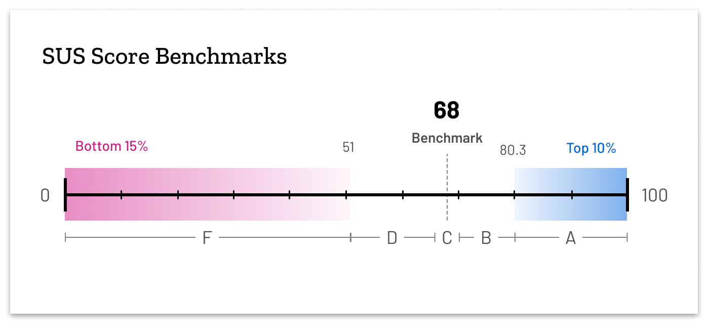
Users’ responses are scored on a scale of 0-100. The average SUS score is a 68. Scores above 80.3 are considered to be in the top 10% of scores, while any score below 51 is in the bottom 15% of scores. If you compared SUS scores to letter grades on an exam, anything above an 80.3 would be considered an A, while anything below 51 would be considered an F.
SUS is best used to judge a product’s overall usability. However, it should be used only after a user has interacted with your product deeply enough to have a holistic understanding of how it (or a significant portion of it) works. Only then can they provide meaningful answers to SUS’s questions.
Net Promoter Score (NPS)
A Net Promoter Score measures how willing a user would be to recommend your product to others. This measurement of loyalty can be helpful in promoting user-centric design solutions across your team. To determine a NPS, you only need to ask one question: “On a scale of 0 to 10, how likely are you to recommend this product to a friend or a colleague?” (where 0 equals not likely to recommend and 10 equals extremely likely to recommend.)
Based on their answer to this single question, users are divided into three categories:
- Detractors (score of 6 or lower)
- Passives (score of 7 or 8)
- Promoters (score of 9 or 10)
In order to calculate the final score, researchers subtract the percentage of users who are detractors from the percentage of users who are promoters. The number you are left with is your NPS score. A score of 35 or above is considered good. However, looking at the percentage of detractors, passives, and promoters can also be illuminating.
In order to use the NPS, you have to at least be able to demo your product and explain its features to your users. They have to understand what they would be recommending before they could give you an honest answer. However, NPS scores shouldn’t be used in a vacuum. They should always be accompanied by qualitative data that sheds light on the score. You also need to strongly consider your audience—how frequently would a student recommend an EdTech product to a friend?
Affect Grid
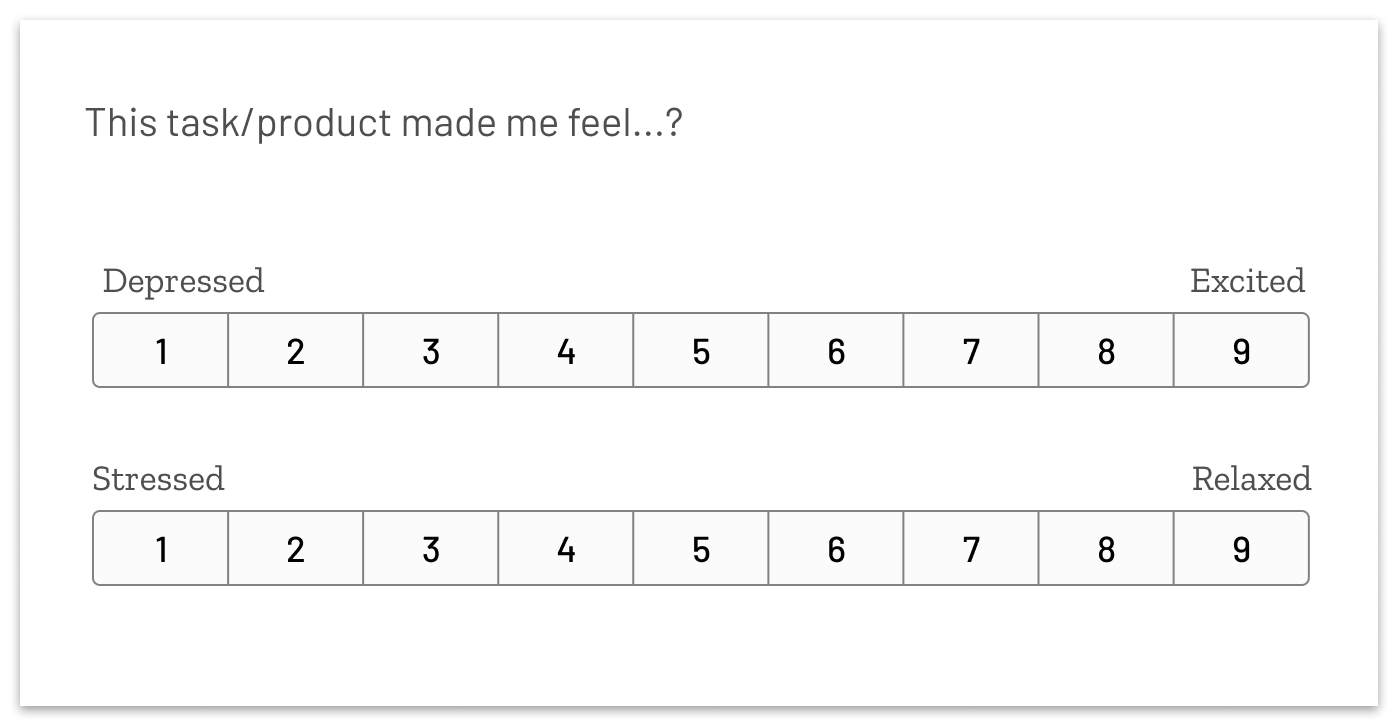
The affect grid is a tool that measures the way your product impacts your users’ mood or affect.
The grid uses two dimensions: Depressed versus excited and stressed versus relaxed. Users rate the way your product makes them feel using the following Likert scales (a scale used to measure respondents’ attitudes):
Next, their responses are plotted on an Affect Grid that gives a quick visual reference of your users’ quality of experience, ranging from poor to exceptional. Plotting data points from all users on the same graph gives a holistic picture of the overall experience.
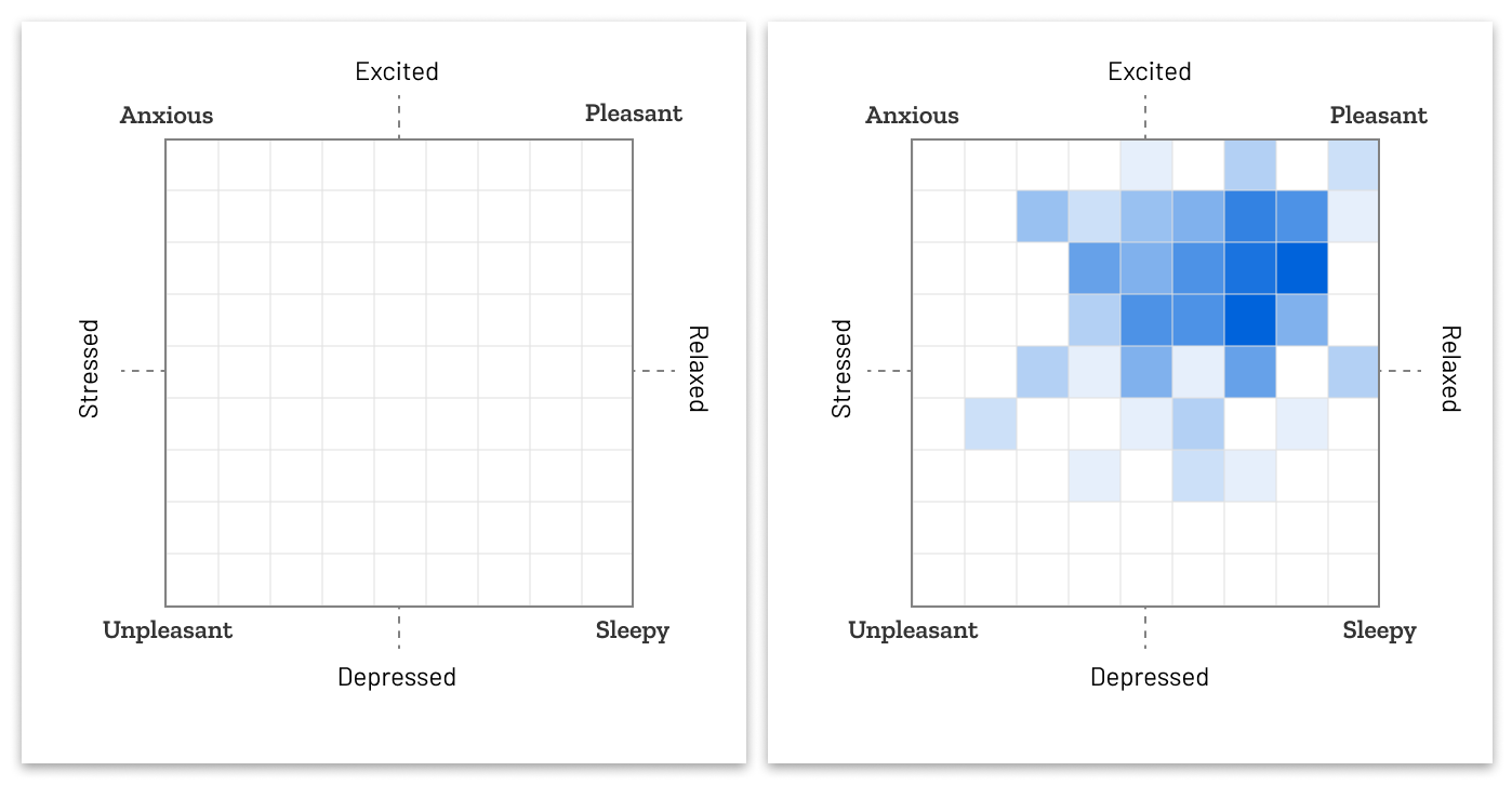
Exceptional scores fall high into the top right quadrant of the grid, meaning that users have high excitement but also feel relaxed. Poor experiences fall into the bottom left quadrant of the chart, indicating an experience that is highly unpleasant and stressful.
You can use the Affect Grid to quantify the user experience of one or more tasks. For example, you could use it to individually measure each of the various tasks a user might take over the course of an average session with your product. From there, you can determine which tasks cause the most negative reactions and prioritize improvements accordingly.
User Experience Questionnaire (UEQ)
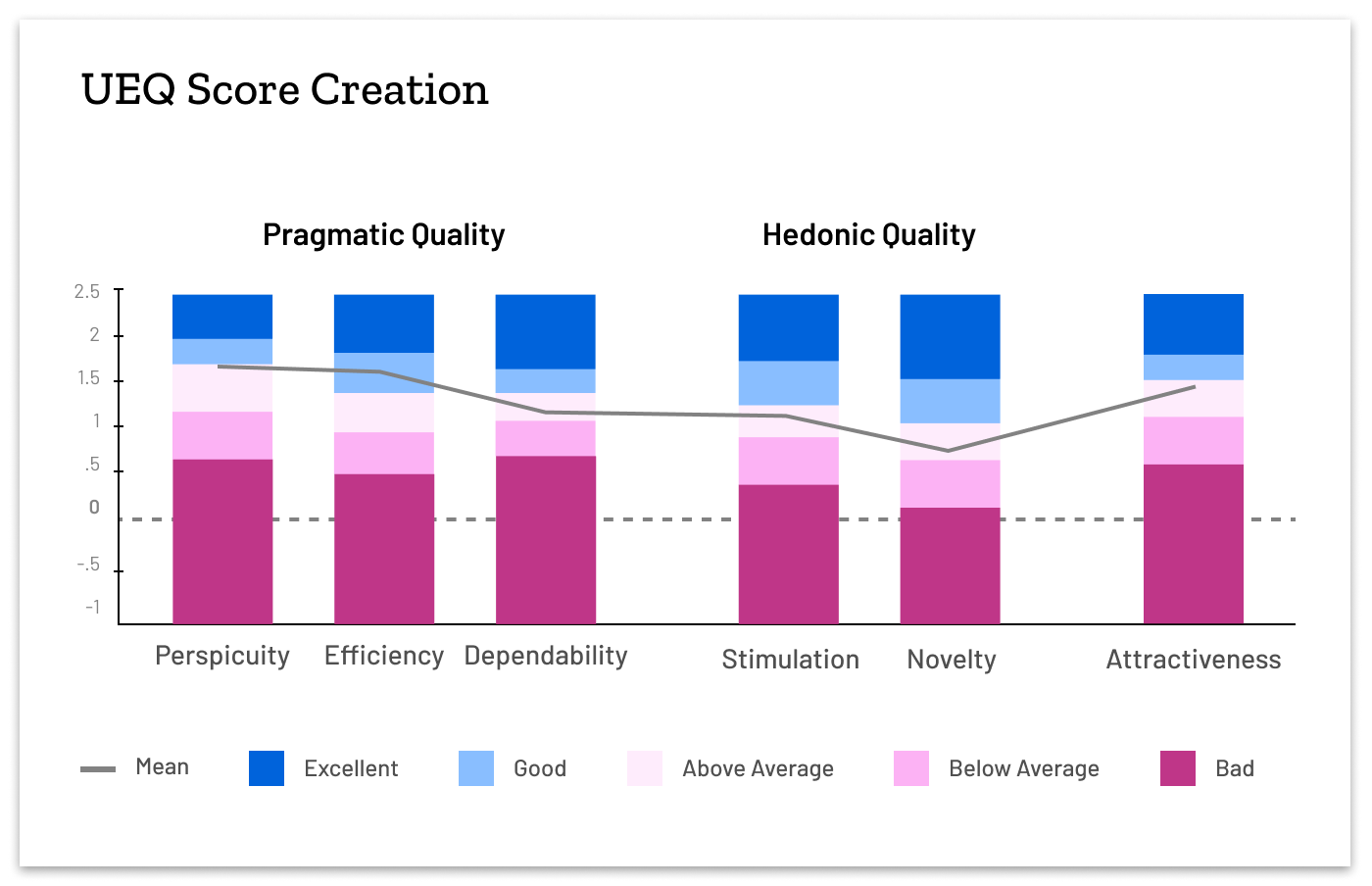
The UEQ is a standardized method to measure and quantify users’ subjective product experiences. It comes in a short and long version. The long version evaluates a product’s attractiveness, clarity, efficiency, dependability, excitement, and novelty. The short version combines the seven data points listed below into three: Pragmatic Qualities, Hedonistic Qualities, and Attractiveness. Users rank the product according to a series of adjective pairs (such as annoying versus enjoyable) that are arranged on likert scales.
Similar to SUS, the UEQ is best used after you have given your user one or more tasks to complete in your EdTech product. However, the UEQ yields more nuanced scores that can give further direction for exploration or next steps. The UEQ provides information from each individual scale, along with defined scores for different aspects of the product. By identifying the adjective scales that contribute to each category, you can also tailor your own series of questions to look specifically at the categories that address the goals of testing.
- Perspicuity. Is it easy to get familiar with the product and learn how to use it?
- Efficiency. Can users complete their tasks without unnecessary effort? Does it react quickly?
- Dependability. Does the user feel in control of the interaction? Is it secure and predictable?
- Stimulation. Is it exciting and motivating to use the product? Is it fun to use?
- Novelty. Is the design of the product creative? Does it catch the interest of users?
- Attractiveness. Overall impression of the product. Do users like or dislike it?
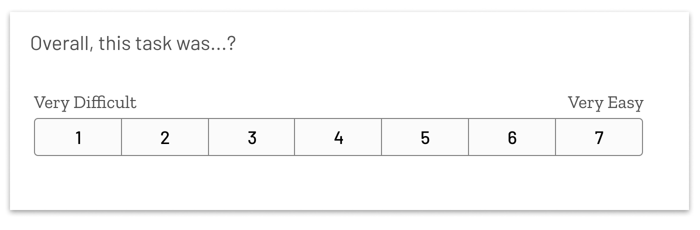
The Single Ease of Use Question (SEQ)
The Single Ease of Use Question is derived from SUS. It isolates and evolves the single most impactful question in the SUS assessment (I thought the system was easy to use) to a 7-point scale question that can stand on its own and be administered directly after a user attempts a task. The question is:
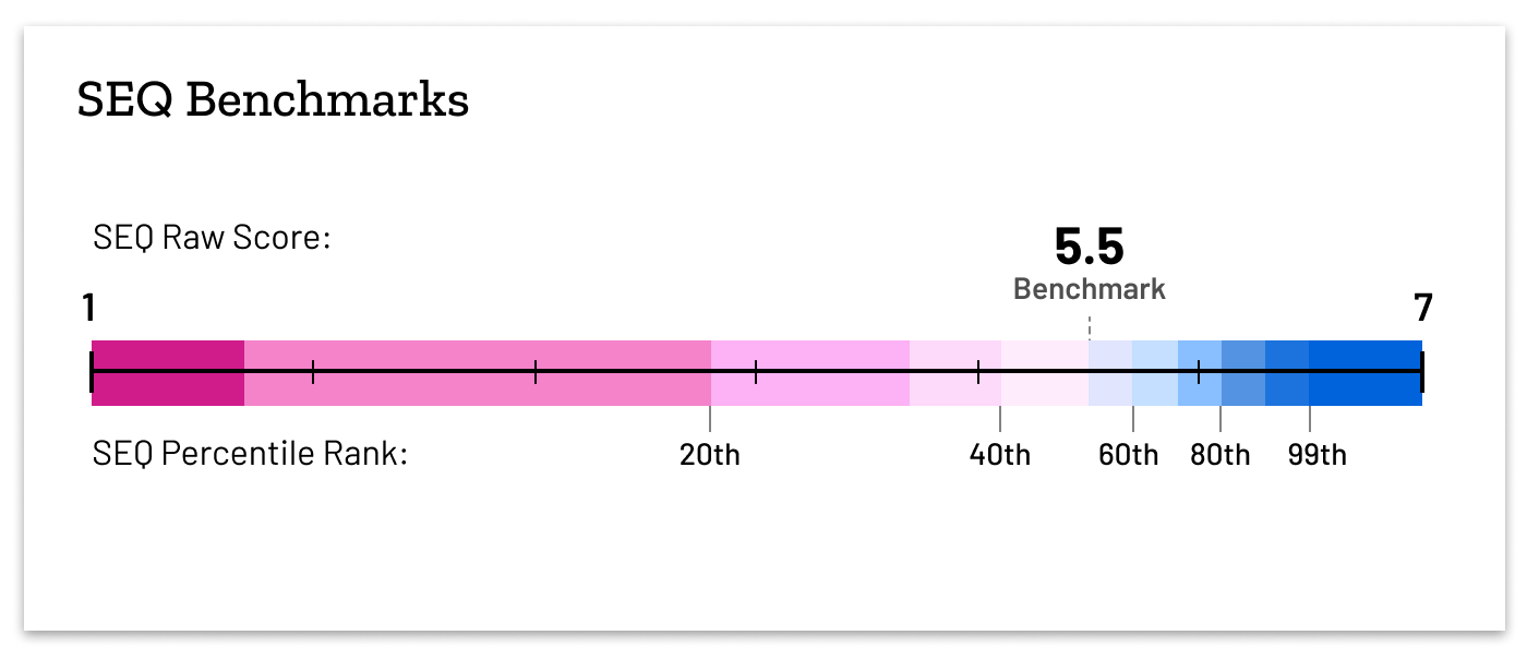
The average SEQ score is around a 5.5. The SEQ is most appropriate for robust prototypes and user assessments in which the user controls the mouse.
What to Consider When Selecting UX Metrics for Your EdTech Product
Consider the following factors when selecting and administering UX metrics.
- Align metrics to your business goals. The metric you use should align with your research goals as well as your stakeholders’ preferences. For example, let’s say you need to convince your internal stakeholders of the need to prioritize certain pain points based on your qualitative findings. In that context, you should select metrics that most clearly and impactfully validate your qualitative findings.
- Don’t look at metrics in a vacuum. Metrics are an incredibly useful way to track change over time or compare one version of a design to another. However, you should always couple them with qualitative data so that you understand the “why” behind them.
- Know your degree of confidence. If you’re using metrics to shape important decisions, make sure you understand the significance of your findings (in the form of your metric’s confidence interval or standard deviation). For example, one design might score slightly higher on SUS than another. But when you run the results through a statistical calculator, you might find the results aren’t actually statistically significant.
- Avoid biases. Select and customize UX assessments as needed to avoid biases. For example, most students don’t choose their own EdTech products; rather, they are assigned by instructors. Because that’s true, they would never recommend a product to another student. As a result, you might want to avoid using the Net Promoter Score, which specifically asks whether a user would recommend a product.
UX metrics are a key piece of the user experience research puzzle. Use them wisely, and you can quickly measure your product’s problems and progress in ways that validate qualitative findings, track progress, and bring stakeholders into alignment.