If your EdTech company is committed to your product’s UX, then you already know UX research isn’t a one-and-done activity. It’s an ongoing, holistic part of your product life cycle. Which means that your UX team may generate dozens of research reports over the course of a single year. Each individual report tells a story and provides actionable insights. But as your research scales, so does your data. Before you know it, you can amass an avalanche of information — with no simple way to make sense of the bigger picture story it tells.
This isn’t a problem for your product team. After all, they live and breathe your product’s on-the-ground details. But it’s a different story for executive-level EdTech leaders like you. You can’t attend every research debrief or read each and every research report. Yet you must be able to speak knowledgeably about the broader UX research trends, such as which users you are testing, what methodologies your UX team is using, and what those tests reveal about your users.
As an EdTech leader, you need to be able to quickly and easily parse months’ worth of UX data without digging through numerous research reports in piecemeal fashion. At Openfield, we believe that your UX partner should lead the way in giving you the access and insights you need by presenting data-driven insights in a shareable, consumable format as your data scales.
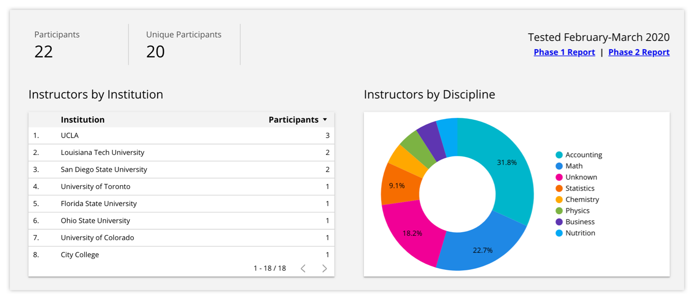
In this example, we simplify long-term understanding of user research into consumable, skimmable packets that are updated in real-time.
More Data, More Problems: UX Research Data Analysis at Scale
Think back to when you first started investing in UX research. At the time, your biggest problem was that you didn’t know enough about your users. But once you got up and running, your users’ world opened up to you. You quickly learned just how many insights you could glean from each individual research report.
As you invested more deeply in UX research and testing, you grew accustomed to collecting data and insights on an ongoing basis. But at some point, your problem started to change. Instead of not having enough information about your users, you now have so much information that you may be struggling to leverage it to its fullest potential.
The truth is that UX research — over time and at scale — produces an overwhelming amount of information. This only multiplies when you consider how many decisions are made at the product and design levels based on each round of research. Unless you’re involved in the research as it happens, it can be very difficult to piece together the context of a series of tests. You may have relational data sprinkled throughout a handful of tests that are spread six months apart. Even if your UX team prepares clear and actionable research reports, you may have trouble fully reconstructing your team’s insights and decisions.
In addition, as you collect more and more information, you gain the potential for deeper and wider insights — insights that can only be uncovered by drilling deeper into your total pool of data. If all you have is a series of one-off research reports, then your only recourse is to manually analyze a sea of data.
What you need instead is smart reporting. Reporting that collects and serves up your ongoing UX findings and most actionable takeaways. Reporting that tells the full story — beginning, middle, and end — including what happened in between rounds of research.
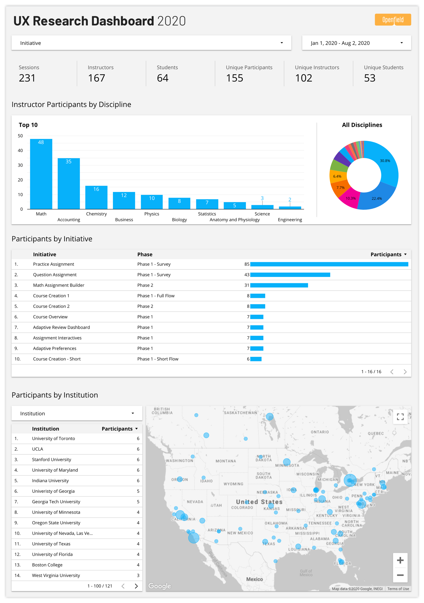
To help our executive-level clients make sense of the big-picture, we use Google Data Studio dashboards to compile visual reports of the most relevant data from ongoing user testing.
Uncovering Big-Picture UX Insights With a Customizable Research Dashboard
Your individual research reports should fully document your testing tactics and results for your product team. But they should also capture the key, at-a-glance takeaways that are most important for executives to understand. Documentation provides the rationale, while summaries should set the table for your team’s options and decisions.
However, as the quantity of reports and data increases, even the best summaries aren’t enough to serve EdTech executives as they seek real-time answers. We leverage Google Data Studio to roll up ongoing and growing testing data into a customizable dashboard of continuously updated results. This enables executives and other stakeholders to quickly access their complete history of research activities, and allows them to interact with the data to isolate the exact information they need in their day-to-day.
The dashboard is custom-built to display the findings that matter most to your leadership team, CX team, and other decision makers. For example, your dashboard might track:
- Number of testers
- Names and emails of testers
- Instructor testers’ titles and disciplines
- Student testers’ grades and majors
- Number of testers from each school
- School program type (two-year, four-year, or postgraduate)
- Testing methodologies
- Test metrics (how many questions were asked, how long was the test, etc.)
- The questions asked in each test
- Test results
Once your dashboard is set up, you can check in on it at any point to get a real-time snapshot of your current (and overall) UX activities. In addition, you can slice and dice your data to uncover new insights. For example, you could compare users across multiple feature sets to discover the extent to which their needs align. Do biology professors at four-year colleges express the same needs as their counterparts at community colleges? How do STEM majors versus English majors respond to a proposed new feature?
With a bird’s-eye view of your UX research data, you can identify trends and even identify new questions for future research.
Finally, as your data continues to scale, your dashboard will grow right along with it. Meaning you’ll always have the information you need at your fingertips to make the right decisions for your EdTech product.
Interested in learning more about how Openfield can help you make sense of your UX research? We’d love to hear from you.