Wolters Kluwer Health: CoursePoint+
Research leads to design improvements that better align to how users think and work
Openfield helped Wolters Kluwer uncover a serious issue that was causing user friction in their product, CoursePoint+. By realigning the user experience to mirror how instructors think and work, we eliminated user frustration and increased satisfaction. In addition to product improvements, we helped establish new standards for best-practice UX research and design processes for their internal teams.
Research Aligned Designs with Existing User Mental Models
Instructors are used to thinking in terms of the classes they teach, not the way a product is built. But CoursePoint+ was organized by publications.
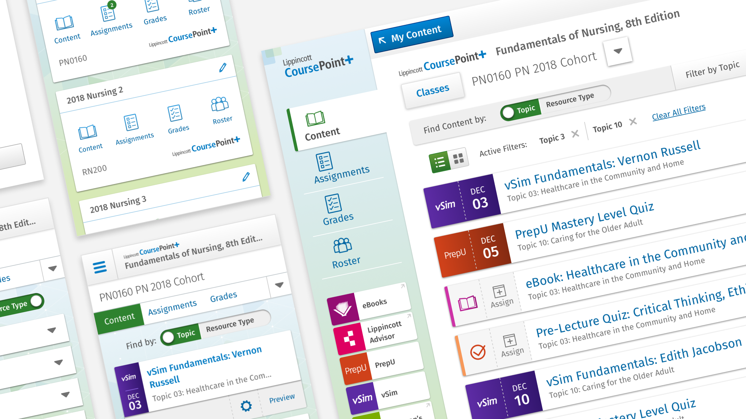
Baseline testing revealed instructors’ well-worn mental models, which guided design changes to class controls that match their expectations.
Class switching controls make it much more efficient to move from class to class, reducing time spent on course management.
I think about things in terms of the classes I teach, not the publications I use, so it’s not organized the way I would expect it to be.
Instructor describing pain points during baseline testing
Consistency Reduced User Friction
UX inconsistency across the product suite meant users often had to relearn multiple ways to perform the same tasks.
A componentized design system was created to establish a foundation for consistency across various workflows and products.
Three products in the Wolters Kluwer Health suite now use a common design system, reducing user confusion and strengthening the brand.
An Evidence-based Path to Product Improvement
UX audit and benchmarking set the bar
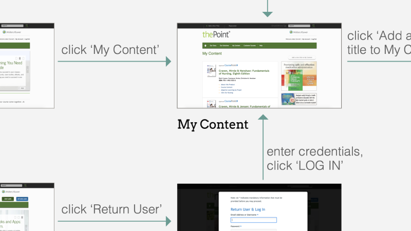
Openfield conducted a thorough UX audit of the existing product to establish an objective assessment of potential user pain points. We then conducted benchmarking research showing how both competitors and analogous product experiences dealt with similar challenges.

We led a Google Sprint session to align and explore solutions
We moderated a condensed, one-day Google Sprint work session with stakeholders from product, marketing, sales and engineering teams. This multidisciplinary group mapped out current user flows, identified pain points and explored potential solutions. Lightning talks aligned the team to six primary business goals under which potential solutions — expressed as “How Might We” (HMW) statements — were organized.
A prioritization matrix informed a working roadmap
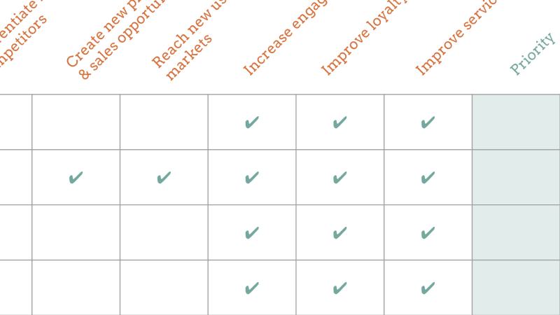
Using the HMWs created by the team, we developed a matrix showing which problems and solutions would help achieve the most business goals set forth by leadership. Solution sets were then grouped into initiatives that could be prioritized, approved and kicked off.

User testing uncovered significant pain points
User testing revealed a major disconnect between the product experience and instructors’ mental models. Instructors do not think about their workflow in terms of what publications they use — they are course-centric in the way they approach their work. The product, however, was organized by publication with courses being a subset of publications. This meant instructors had to drill down into various different publications to access the course content they needed.

A new design system established a new foundation
We introduced component-based designs that leveraged consistency to mitigate user friction and product development inefficiencies due to years of design debt across the product suite. Students and instructors can now rely upon consistent UX patterns across multiple CoursePoint products, and product teams are more efficient.
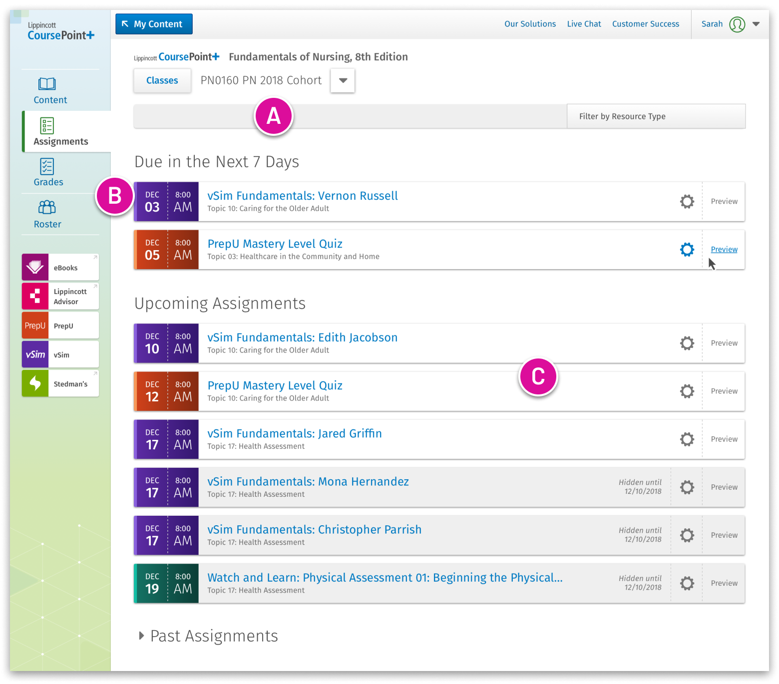
New Assignments and Classes Screens
ASSIGNMENTS
CLASSES
A. Visible class controls
Class management features are now highly visible, allowing instructors to easily switch among classes with ease.
B. Clear navigation
Navigation better matches instructor and student mental models by better anticipating their expected workflows.
C. Consistent activity components
New components for assignable activities use common patterns across all views, reducing the need for users to recall how the product works.
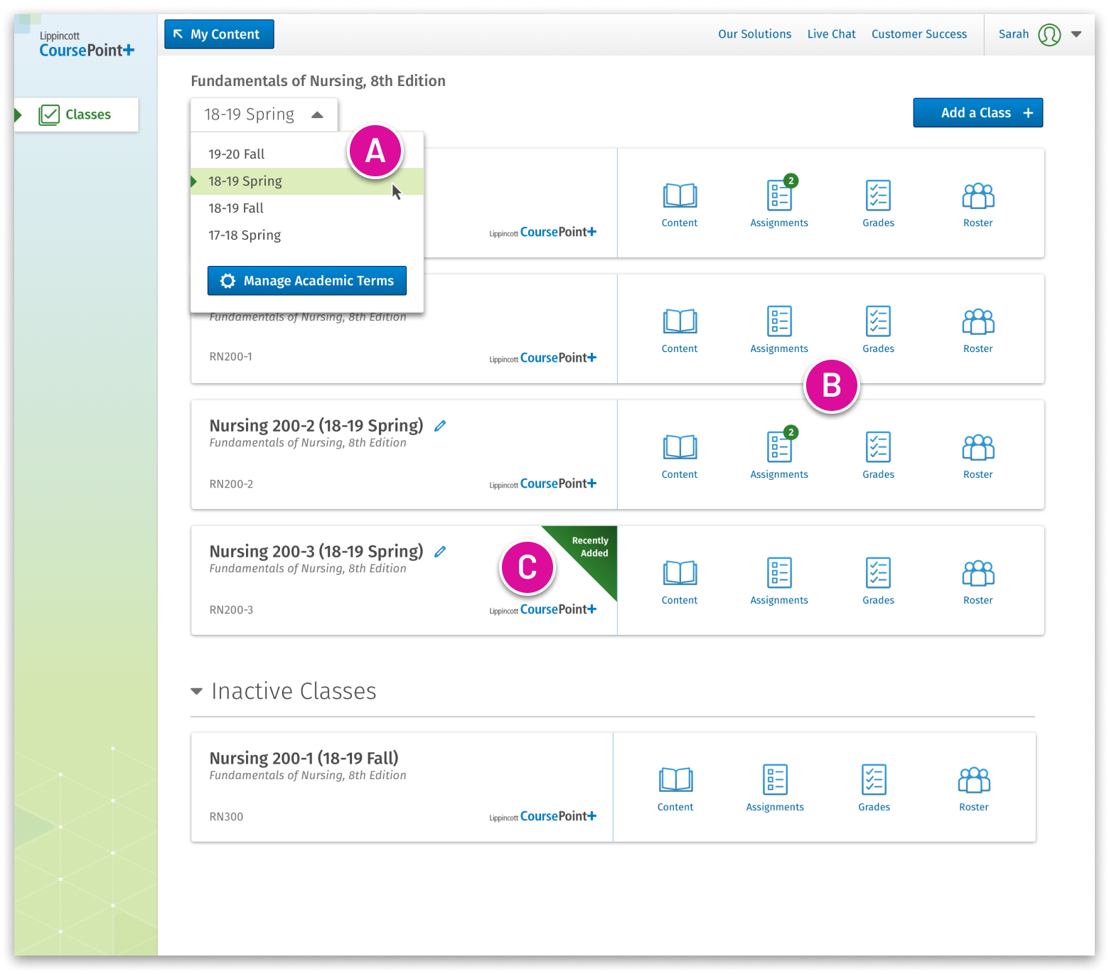
A. Switching academic terms
Instructors can easily find classes by selecting a different academic term.
B. Access points to class content
Convenient buttons provide direct access to content, assignments, grades and rosters for each class.
C. Identifying newly created classes
Clear indicators flag newly created classes for easy identification.
About Wolters Kluwer
With more than 19,000 employees serving customers in over 180 countries around the world, Wolters Kluwer (WK) is a global provider of professional information, software solutions, and services for clinicians, nurses, accountants, lawyers, tax specialists, and finance, audit, compliance, and regulatory sectors.
Part of the Wolters Kluwer Health products and services portfolio, Lippincott CoursePoint+ is a powerfully integrated, digital learning environment that combines tools, case studies, real-time data and the most trusted nursing education content on the market to elevate student success and preparedness for the transition to practice.
UX Capabilities at Openfield
User Research & Testing
Focus all stakeholders and team members on what really matters to your users. Make more confident decisions about what you deploy and when.
Learn MoreIdeation & Planning
Align product features and flows with the real-world wants and needs of student and instructor users.
Learn MoreDesign & Prototyping
Create and validate bar-setting user experiences that will endear students and instructors to your product.
Learn More