As an experienced EdTech professional, you already know that technology is transforming the way educators share knowledge and interact with students. But the technology boom is changing more than just the way education is delivered.
It is also generating an unprecedented quantity of data — data with the potential to revolutionize the way administrators, instructors, and students manage schools, teach, and learn. EdTech companies are in a unique position in that they are the ones generating and collecting this sort of data. Yet many of them are still figuring out how best to use it.
Data visualization is an increasingly important tool to leverage the data your product may already be creating. You might think it’s all about making products look more “sexy” with flashy dashboards. But the reality is that there are many concrete benefits behind all the charts, diagrams, and maps.
In fact, by investing in an effective data visualization strategy for your EdTech product, you can help your users achieve better outcomes. You can assist administrators in making more confident decisions, enable instructors to take proactive interventions, and help students build better study habits and increase their understanding. Here’s how.
How Data Visualization Can Benefit Students
At the student level, data visualization can increase engagement and improve performance by helping students:
- Grasp hard-to-understand concepts through visuals. By distilling complex ideas and data sets into clear, purposeful, and engaging visuals, data visualization can be used in courseware to deepen students’ engagement and understanding. This format may be especially useful for visual learners, students with lower literacy rates, and ESL students. If your EdTech product delivers course material, data visualization can play an important role in more deeply engaging your student users.
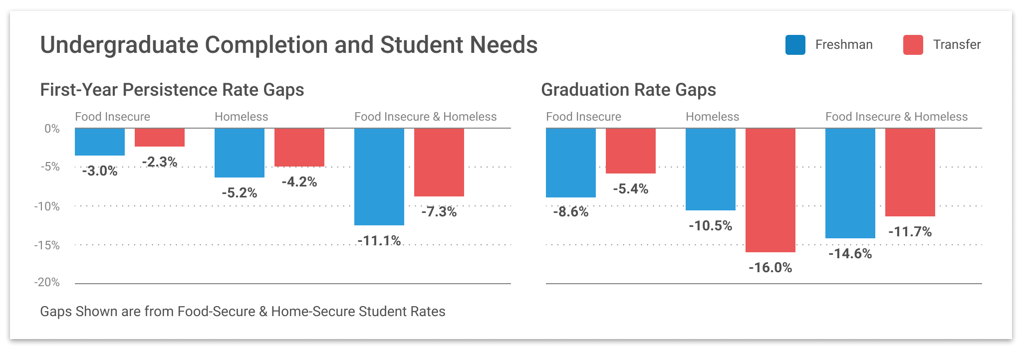
- Identify gaps in their knowledge. Data visualization can also be used to deliver individualized feedback to students about the subject matter areas in which they need improvement. For example, a product could deploy data visualization to map a student’s incorrect test answers to specific topics to uncover knowledge gaps. With this information in hand, students would be able to study for the next test or assignment in a more targeted way.
- Track their progress and performance. With the help of data visualization, your product could give students real-time feedback about how they are progressing and performing in a particular course. This might take the form of a dashboard that serves up information about a student’s average performance across assignments and tests, the percentage of coursework they have completed, upcoming assignments, and the overall grade a student is on track to make in the class.

How Data Visualization Can Benefit Instructors
Data visualization can give instructors deeper insights into their classes and teaching methods than they can gather through grades and observation alone. Specifically, data visualization can enable instructors to:
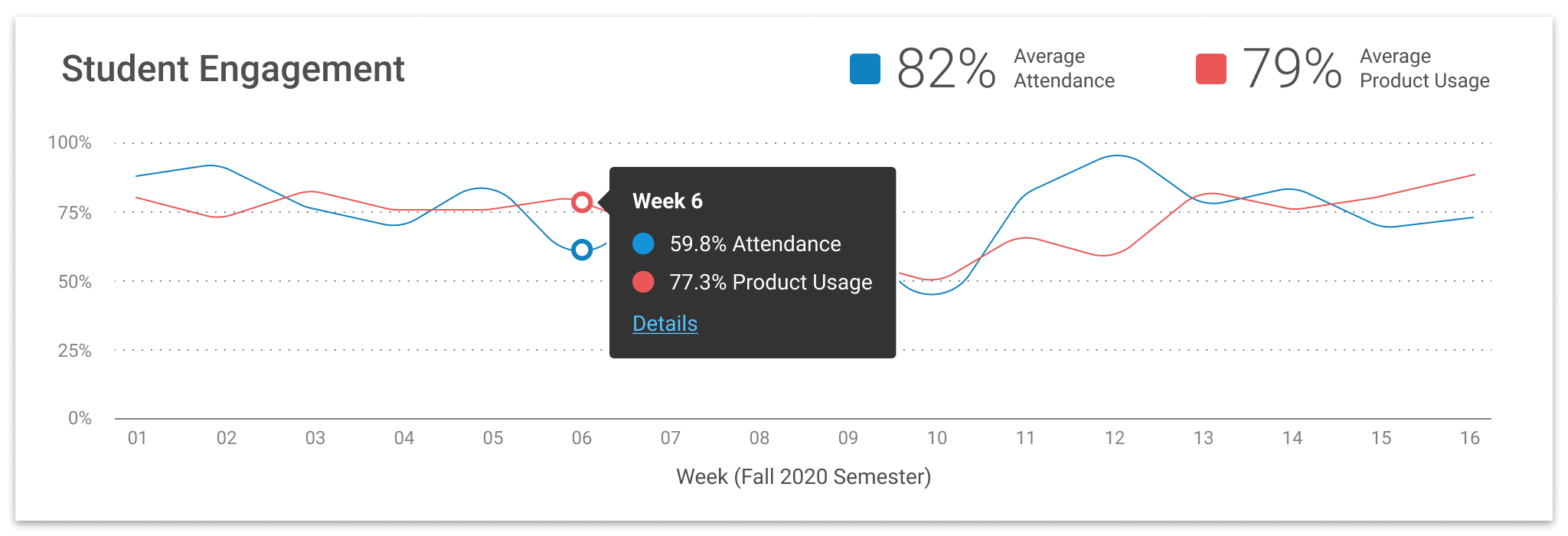
- Proactively identify students who are falling behind and suggesting the right interventions. Data visualization can be used to track and highlight early indicators of decreased student engagement, such as absences, missed homework assignments, and even time spent on various activities. These early warning signals can help instructors consistently identify at-risk students sooner than they otherwise would — and suggest the most effective interventions.
- Uncover the most effective teaching methods. Most instructors are naturally attuned to assessing various teaching methods to see which ones seem to produce the best results. However, without hard facts to back up their observations, many teachers are left with little more than gut instincts. By tracking student behavior and correlating those behaviors with student performance, data visualization can give instructors the data needed to select the most effective pedagogical approaches.
- Understand how students interact with assignments. The more data instructors have at their fingertips, the better they can understand the way students are really engaging and learning. In some cases, they may find that their assumptions are upended. For example, an instructor may believe that a particular assignment should take an hour. But data visualization linking time spent on the task and students’ grades might reveal that successful students actually needed double that time. Information like this gives instructors a window into how students are behaving — and an opportunity to fine-tune coursework as a result.
- Tracking cohorts of students to see how they measure against other classes. As a product collects and visually displays data from various groups of students over time, instructors can identify variations in student performance at the cohort level. This enables them to identify trends over time and test out new pedagogical approaches.
How Data Visualization Can Benefit Administrators
At the administrative level, data visualization can be used to:
- Drive faster, deeper insights. For administrators, the insights offered by data visualization can be found at the macro level. With smart data visualization tools, administrators can spend less time interpreting a mountain of data — and more time acting on it.
- Arrive at more confident scheduling and resourcing decisions. With the right data visualization tools, administrators can make more informed decisions about instructor resourcing, class schedules, and more.
- Improve communication. With a stronger handle on the insights flowing from their data, administrators can more clearly communicate their findings down the chain.
Data visualization represents a major, as-yet underutilized opportunity for EdTech companies. The time to start is now. By investing in data visualization, you can deliver unexpected insights and data-driven recommendations that will take your product from useful to indispensable.