Say the words “exclusive design,” and the average person probably starts picturing high-end fashion brands and electronic devices. After all, in the world of marketing, “exclusive” is a good thing. But in the context of digital products, exclusive design isn’t a positive feature. It’s a preventable failure.
When it comes to EdTech products, an exclusive design pattern is one that doesn’t meet the needs of all of its users. In other words, it’s a design pattern that only works well for certain groups of people, such as visual users or those with a mouse in addition to a keyboard.
If you aren’t careful, exclusive design patterns and elements can sneak their way into any aspect of your product’s user interface, from workflows all the way down to individual components. And as soon as that happens, your product’s user experience suffers — for everyone.
The first step in fixing exclusive design patterns is understanding why we create them in the first place. Only then can you figure out how to guard against them. Here’s what you need to know to keep exclusive design patterns at bay.
What Causes Exclusive Design Patterns in EdTech Products — and How to Guard Against Them
Exclusive design patterns are almost always the result of carelessness, not malicious intent. It’s natural for designers, researchers, and engineers to implicitly assume that their users will think and act more or less like themselves, with similar abilities and mental models. It all boils down to bias.
If you make your design decisions based solely on your own abilities and use cases, then you will necessarily miss the exceptions and edge cases. The result? A product that alienates whole subsets of users.
Certain UX principles and best practices can actually become unintentional causes of exclusive design patterns. For better or worse, the Pareto Principle (also called the 80/20 rule) has found its way into many UX workflows. This principle dictates that UX teams can efficiently meet users’ needs by designing solutions that address 80% of use cases and workflows. Some people call this approach “designing for normal.” And while it can help product teams prioritize, it can lead them to neglect the needs of minority users.
To understand the danger of “designing for normal,” consider this example courtesy of Jared Spool. When women joined NASA’s space program, they had to actually cancel a spacewalk because the spacesuits didn’t fit properly. The reason? The designers based all of their decisions on the average (“normal”) male body.
Exclusive design patterns are a major problem for digital products in any industry. But they are even more of a concern for the EdTech space. After all, if EdTech products aren’t accessible to all users, then they effectively undermine equity in the educational system. It’s a serious matter — one that is underscored by a recent rise in accessibility-related lawsuits in the EdTech space.
Rigorous user testing is the remedy. That means testing your flows and patterns with a broad range of users, including people with disabilities. There are plenty of tools out there to test the level of compliance and conformance of your design, but they should never replace user testing.
And here’s where it gets really interesting: The more your product design accounts for edge cases and users with different needs, the better your user experience will become for everyone.
4 Top Exclusive Design Heavy Hitters — And How to Avoid Them
Without taking special measures, the following common UI components are especially vulnerable to exclusive design.
1. Slider components
Slider components allow users to adjust an element’s volume or size, or to incrementally shift a number up or down. These components are fun and easy — but only for dexterous, sighted users with access to a mouse, trackpad, or mobile device.
Users with larger hands or a limited range of motion in their fingers may find it challenging to accurately move the slider to the intended setting. And non-sighted keyboard users will likely find it very cumbersome to increment a number one digit at a time until they achieve the desired outcome.
If you are dead-set on using a slider component, try pairing it with a simple input field. That way, users can bypass the slider altogether as needed.
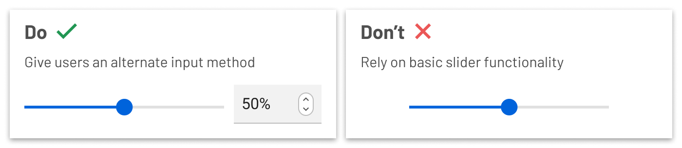
Give users an alternate input method such as a text field. Don’t rely on basic slider functionality.
2. Data Visualizations
Data visualization can be extremely informative and engaging. But it is, by nature, an exclusively visual medium.
In order to create an accessible experience for all of your users, you must make sure that non-sighted users can easily extract all the same data and insights. Be sure to properly label all parts of your data visualization with screen readers in mind. Write specific and detailed metadata that tells non-sighted users exactly what your data visualization is about — and any important takeaways.
Consider how your users interact with a given data visualization. Make sure that keyboard-only users can easily navigate, sort, filter, and access your data visualization.
Finally, enable users to access the raw source data that generates your visualization.
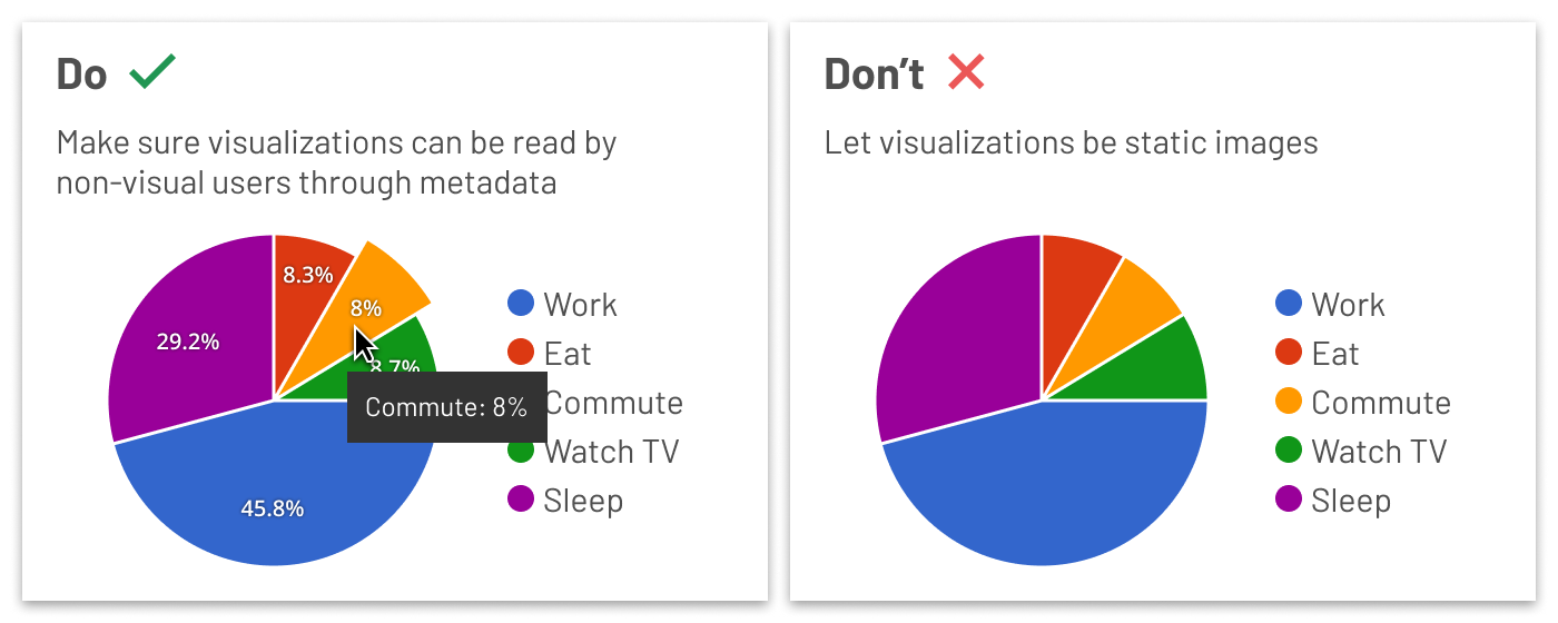
Make sure visualizations can be read by non-visual users through metadata. Don’t let visualizations be static images.
3. Icon buttons
When you are trying to save space in a screen’s design, it is easy to fall back on unlabeled icon buttons. However, without proper preparation, you might unintentionally make these buttons exclusive to specific user types. Using the most common conventions (such as a trash can icon for “delete”) is helpful in terms of reducing confusion. But you should never assume that your users can understand a button’s function based on an image alone.
Anytime you use an icon button, include a tooltip that explains the text equivalent. This allows users to hover over the icon and read what the button’s purpose is. For example, that trash can icon might have a “Delete item” tooltip.
In addition, be sure to include detailed labels for screen readers. What do your non-sighted users need to know in order to effectively interact with a button? Don’t just use the generic “button” announcement; make sure your button labels provide the right level of instruction and context.
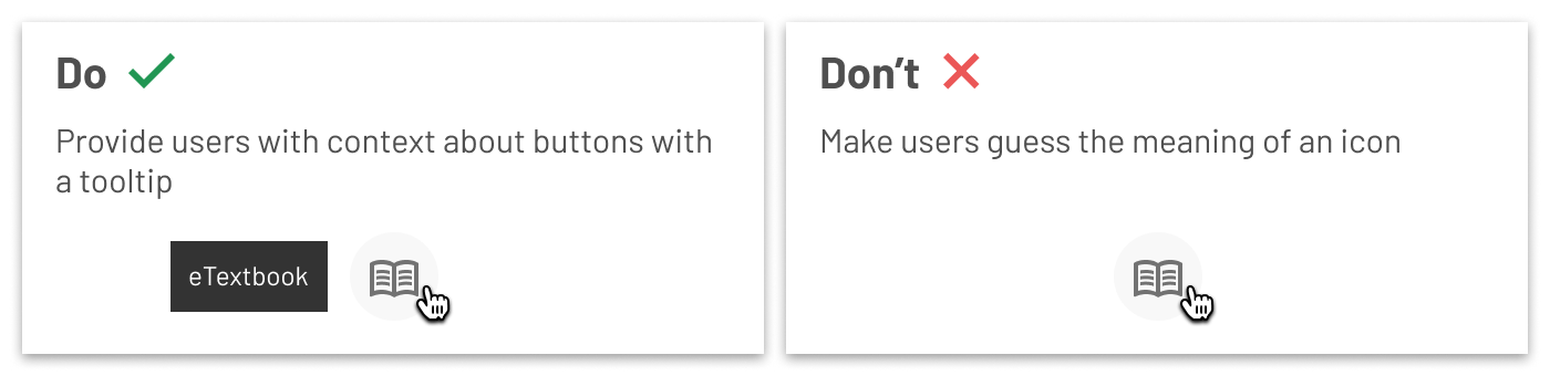
Provide users with context about buttons with a tooltip. Don’t make users guess the meaning of an icon.
4. Verbal Components
The language you use in your product’s microcopy and interactive items can unintentionally create exclusive design patterns. For example, if you use slang words in an effort to inject personality in your microcopy, you risk confusing users for whom English is a second language, as well as users from a different region or cultural background. Language that is plain, simple, and straightforward is far easier for everyone to understand. That doesn’t mean your product copy has to be boring. You still can — and should — work to make it fun, encouraging, and on-brand.
On a related note, make sure you use the right language for the context. For example, “remove” and “delete” are sometimes used interchangeably. But “delete” might seem more permanent than “remove” depending on the action. “Delete” may be more appropriate if users want to permanently remove a message from their inbox, whereas “remove” might make the most sense when removing a student’s name from a roster.
And whatever you do, make sure you use consistent terminology for various buttons and actions throughout your product. If you use “remove” for a particular action in one part of your product and “delete” for the same action in another workflow, you’ll force all of your users to work harder than they should.
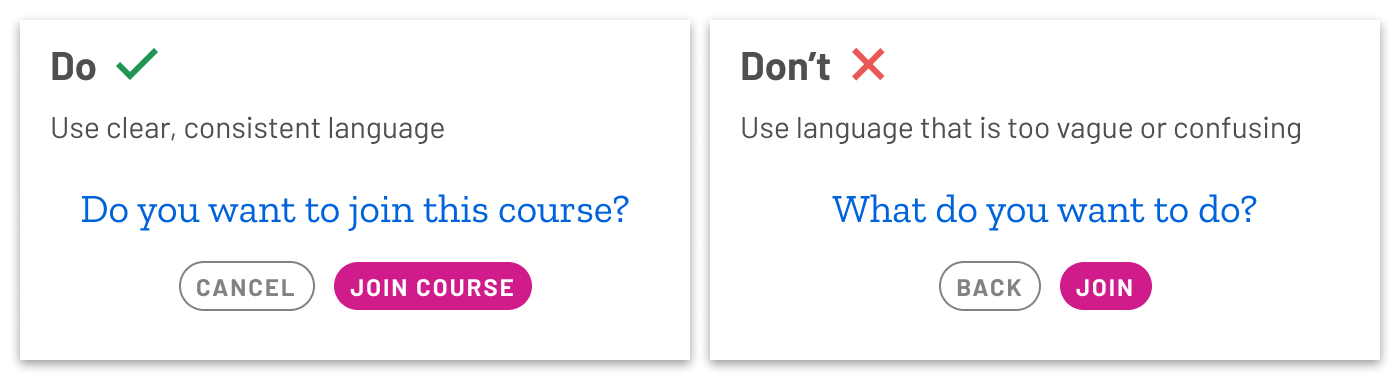
Use clear, consistent language. Don’t use language that is too vague or confusing.
The takeaway? Product teams must proactively place checks on their tacit assumptions and biases in order to avoid creating exclusive design patterns. By shedding light on the perceived edge cases and the needs of users who are different than ourselves, we can start to build more intuitive experiences that are better for everyone.