CASE STUDY: Macmillan Learning Interactive Modules

Interactive modules redesigned to meet learning objectives on any device.

Macmillan Learning: Interactive Modules

Interactive modules redesigned to meet learning objectives on any device.

Using pedagogical learning objectives as our consistent guide, we designed accessible, interactive modules from the ground up. The goal was to provide a rich, exploratory learning experience that supported a wide range of user needs.

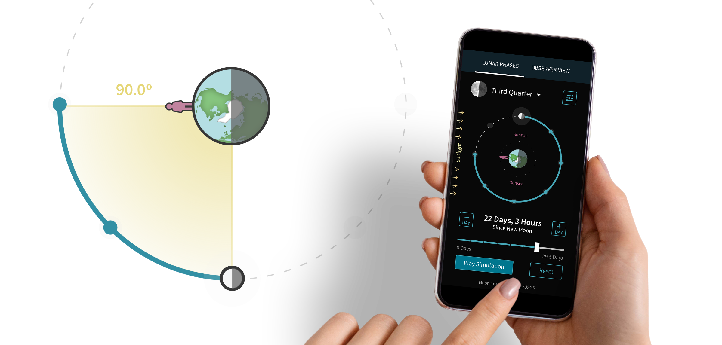
A smartphone being held that shows an astronomy interactive module on the screen. The module displays a circular diagram of the moon's position around the Earth with the direction of sunlight coming from the left side of the screen. A slider allows the user to see where the moon is positioned depending upon the number of days since the last new moon.

Proof of Concept Revealed a Cost-Effective Path Forward

Existing modules weren’t designed for mobile, touch-enabled devices. Key stakeholders were unsure if the educational value could be maintained on smaller screens.

Openfield worked closely with subject matter experts to ground all UX decisions in sound learning principles. Students tested the designs to ensure that learning objectives were attainable.

We achieved pedagogically sound results in a cost-effective way. This success laid the groundwork for redesigning additional modules.

Collaboration led to a viable proof of concept

We needed to prove that effective experimentation was possible with fully responsive designs. Openfield and Macmillan brought together developers, subject matter experts and the UX team for a workshop to create a proof of concept from the Titration interactive module.

Students validated the effectiveness of new designs

After the workshop, we conducted testing sessions on both mobile and desktop. We carefully chose participants to accurately represent the expected end users. Our research team asked them to complete scenarios designed to verify that they could accomplish learning objectives without any guidance or assistance.

Confidence in the process paved the way for further redesigns

The validated concept proved that rich interactions could retain their educational value on any device. This opened the door to tackling more complex modules for an introduction to astronomy course.

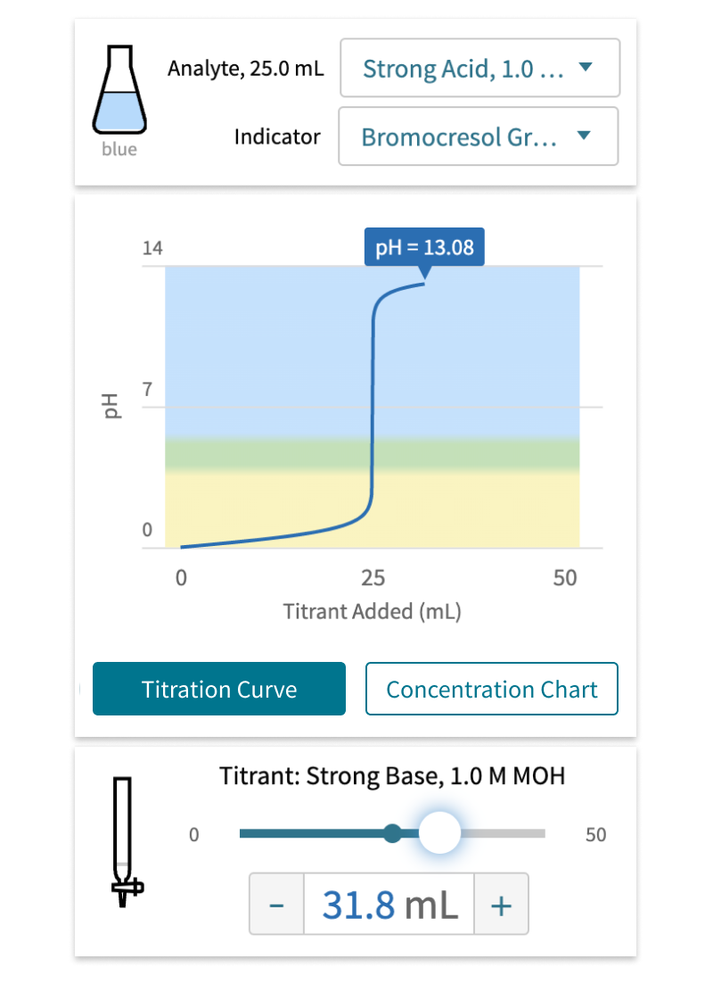
This mobile view of the redesigned titration module shows a flask with liquid in it at the top along with selectors for the type of liquid and type of indicator. In the center of the screen, a large graph shows the amount of titrant the user has added compared to the pH. A slider control at the bottom allows the user to change the amount of titrant that is added.

Building confidence is about continuing to foster alignment and keeping collaboration going throughout a project when everyone’s stepping into the unknown together.

Rich Interactions Drove Flexible Accessibility Design

Complex interactions, such as manipulating objects in 3D, posed unique accessibility challenges. Users needed the freedom to experiment with the content, whether using keyboards, mice, touch devices or screen readers.

Openfield worked hand-in-hand with subject matter experts to write accurate, descriptive screen reader alerts. We coordinated with developers to ensure logical content hierarchies and intuitive interactions on any device.

Users with a wide range of capabilities and device types now can interact with experiments in different ways. We streamlined the design process with a consistent approach for all modules.

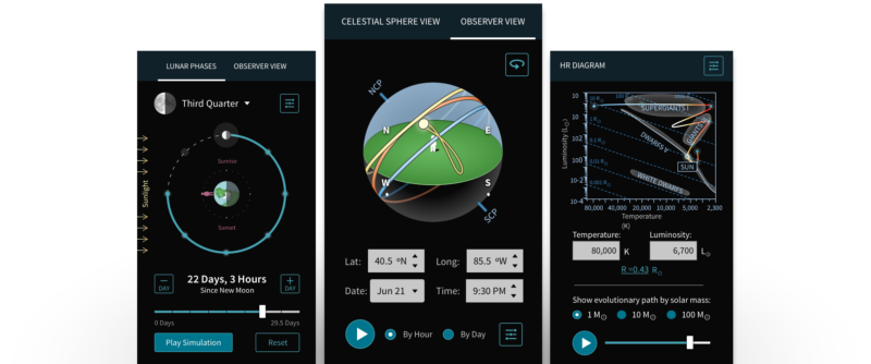
Three mobile interactive module screens are shown from left to right: First is the "Phases of the Moon" module. Second is the "Motions of the Sky" module, which features a 3D sphere mapping the paths of celestial objects in relation to an observer in the center. The third module is the "Hertzsprung–Russell Diagram," which shows a graph of a star's luminosity compared to its temperature.
A crop of the "Motions of the Sky" module showing the celestial sphere, with the Earth at the center, being rotated by the user through the use of three buttons for the X, Y and Z axes.

Accessibility was baked into the design process

Openfield carefully considered accessibility from the very beginning of our design explorations. For example, we gave students the ability to rotate a 3D sphere with various tools. They could drag with the mouse, swipe on a touch device, or use dedicated rotation buttons for each axis.

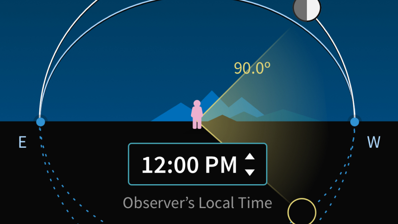
A crop of the "Phases of the Moon" module showing the observer's view of the sky at night. The sun is below the horizon and the moon is visible above.

Dynamic solutions were needed for dynamic conditions

Students needed to change conditions of each experiment, such as time of day or an observer’s position on the globe. WCAG 2.1 standards demanded that legibility be maintained despite real-time changes in color values. The final designs ensured all content met contrast requirements, regardless of experiment conditions.

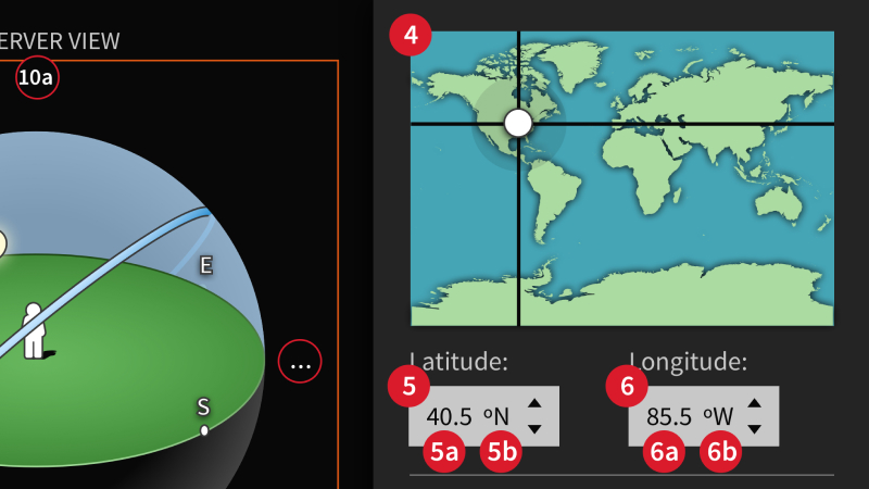
A crop of the "Motions of the Sky" module intended for developers: It includes numbers indicating the tab order for various controls.

Extensive accessibility documentation supported developers

Users of screen readers need spoken alerts to understand how their actions affect an experiment. Working closely with subject matter experts, Openfield identified and wrote accurate, descriptive interaction alerts. We recommended page regions, tab order, aria-labels and other attributes to help developers effectively structure each interactive module.

About Macmillan Learning

Based in the US and Canada, Macmillan Learning partners with the world’s best researchers, educators, administrators, and developers to deliver sound pedagogical solutions designed to facilitate teaching and learning opportunities that spark student engagement and improve outcomes.

UX Capabilities at Openfield

User Research & Testing

Focus all stakeholders and team members on what really matters to your users. Make more confident decisions about what you deploy and when.

Learn More

Ideation & Planning

Align product features and flows with the real-world wants and needs of student and instructor users.

Learn More

Design & Prototyping

Create and validate bar-setting user experiences that will endear students and instructors to your product.

Learn More

Spread the word