Design systems (also known sometimes as common design languages, design guidelines, or unified design languages) are essential to efficient digital product development. They serve as touchpoints that unite the work among teams and across stages of the project.
Often, design systems are treated as “one and done” initiatives — drafted, agreed upon and set in stone. Many a design team has embarked on a fool’s errand, thinking they could anticipate every design need that may arise in the future. If you instead adopt a continuous release approach for ongoing improvements to guidelines, you essentially mirror the product development process itself.
What is a Design System?
Written and spoken languages have building blocks like alphabets, grammatical rules, and spelling conventions. Likewise, a design system has a set of design standards, usage guidelines and driving principles. The system governs how elements like buttons, forms, headings and icons are combined into design patterns that share a common DNA.
Imagine a large team of designers and developers where everyone is off on their own building buttons, menus, and pages. Even if everyone’s referring to the same brand standards, there’s a high likelihood that all of these elements might look and feel just a little bit different. Multiply that across several products in a suite, and you can see how the user experience becomes wildly inconsistent. Small errors get baked into the product and replicated over time. (It’s called design debt, and as it accrues it can threaten the product’s usability.)
Just as important, all that independent work is incredibly inefficient: designers and developers all doing variations of the same task, then having to reconcile and fix the differences in look or functionality.
A design system defines all of those elements consistently across the product or the set of products. It eliminates redundancy and rework, and maintains a high, vetted standard of quality. It creates a shared vocabulary across all product groups since everyone is using the same reference. And it makes testing easier because you can rule out things that are already known quantities and focus on validating the new elements.
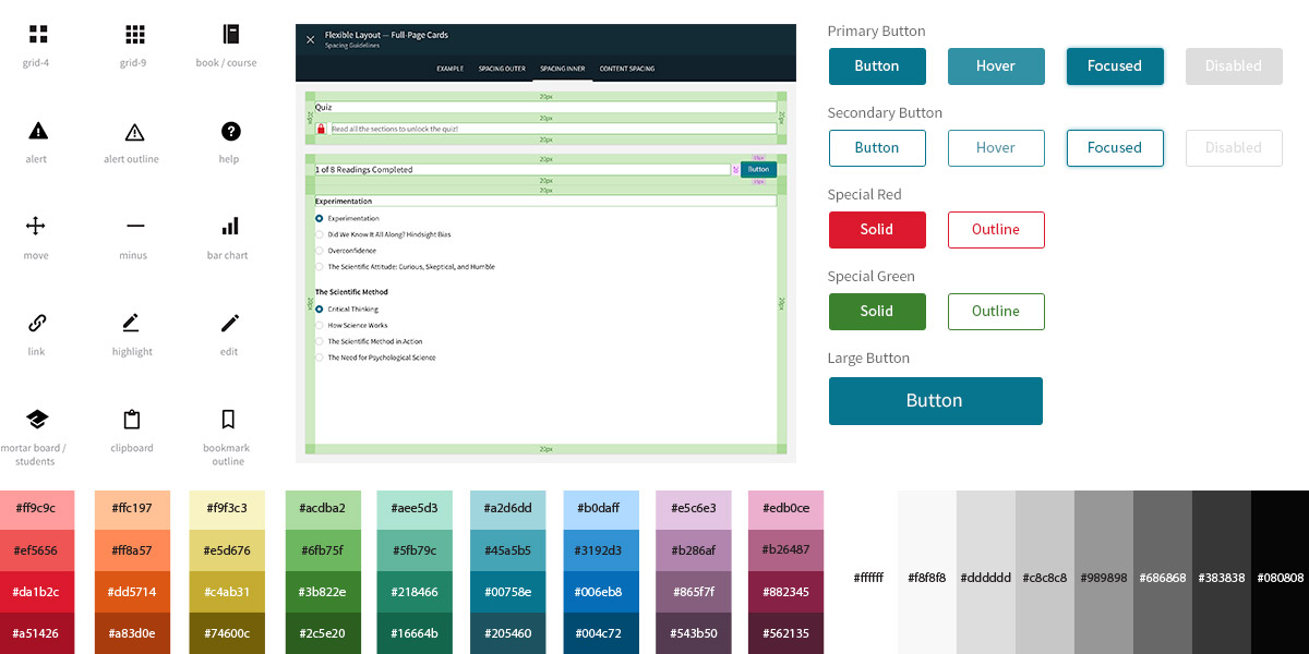
Design systems cover all aspects of product design including iconography, color, spacing, button states, and other basic elements.
Why Design Systems Should Evolve Over Time
It’s a heavy lift to build a design system. But it should be a priority at the start of a major project, especially if your organization doesn’t commonly use them.
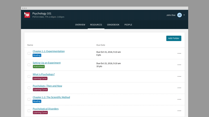
When we began working with Macmillan Learning, the publisher had a suite of 12 educational technology products used by students and instructors in colleges and universities around the world. All of the products had been designed over time by different teams; as a result, the UX was uneven across the board, and customers were frustrated at having to learn different interfaces for related products. At the same time, the product team wanted to reduce costs, streamline the development process — and most importantly, resolve customers’ headaches.
We worked with Macmillan Learning to develop a design system to govern all of their products. As we were initially developing the system, we knew it was critical to gather representatives across the process, so designers and developers would have input. Design systems are often designer-centric, but the system has to be manifested in development language (with coded examples) that’s technology-agnostic. The system also needs to speak to product owners, so they can see what tools are available to them as they envision new features or updates. This cooperative approach facilitated a shared sense of purpose and desire to help each other out as a multidisciplinary team.
It’s also important to establish a flexible wiki or internal platform for documentation of standards that’s accessible to different audiences. This resource becomes the source of truth for everyone involved in making and improving the product.
We considered the system we developed with Macmillan Learning to be a foundation for further growth. While we want everyone to follow the rules, there’s a risk of teams thinking that they can’t evolve the system. User needs change, new business opportunities arise, and the product itself iterates. The system that governs the product’s design and development should shift in parallel.
The concept of Atomic Design provides a good roadmap for how high-level design principles can remain constant while allowing for flexibility and scalability as the design system evolves over time. In an Atomic system of web development, you start with atoms — decisions about type, color, spacing, text styling, links, buttons, and other basic elements — and then build molecules and organisms out of those atoms. Those components might include lists, forms, navigation bars, and so on, in a nested hierarchy. Components may evolve and change over time, but the high-level design principles largely remain the same.
It’s difficult to envision all the scenarios and contexts that the product team will need to design for. So the system defines which elements are fixed and which are fluid. It provides a kit of parts — strong, stable, essential, proven building blocks along with guidelines for how those blocks can be assembled.
Design systems cover more than just typography, colors and layout specifications. They demonstrate behaviors within the product.
Once you get your design system up and running, maintaining and evolving is much easier if you periodically audit and update it. With Macmillan, we’re making iterative updates that can be done in a matter of days or weeks instead of months and months.
The evolution of a digital product reflects a constant tug between the established and the new. Users expect the app to perform in ways they’re familiar with. A set of unified design parameters helps them recognize how different features work from past experiences with other products made by the company, or other aspects within the same product. Updates and upgrades should offer new features and functionality, of course — but within the framework of what users know.
An evolving design system assures a steady equilibrium where the established sets the stage for the new, and the new tugs the established forward.
We can help your team create a fluid design system that finds the perfect balance point, benefiting your designers, developers, product owners, and users.