Human resources managers use the term ‘onboarding’ to refer to the process of getting new employees situated in their jobs. UX designers use the term to describe the process of getting users comfortable with tools or features that are new to them.
In both instances, missteps in the onboarding process raise roadblocks, frustration, and disengagement. And maybe the person — the employee or the user — will simply give up.
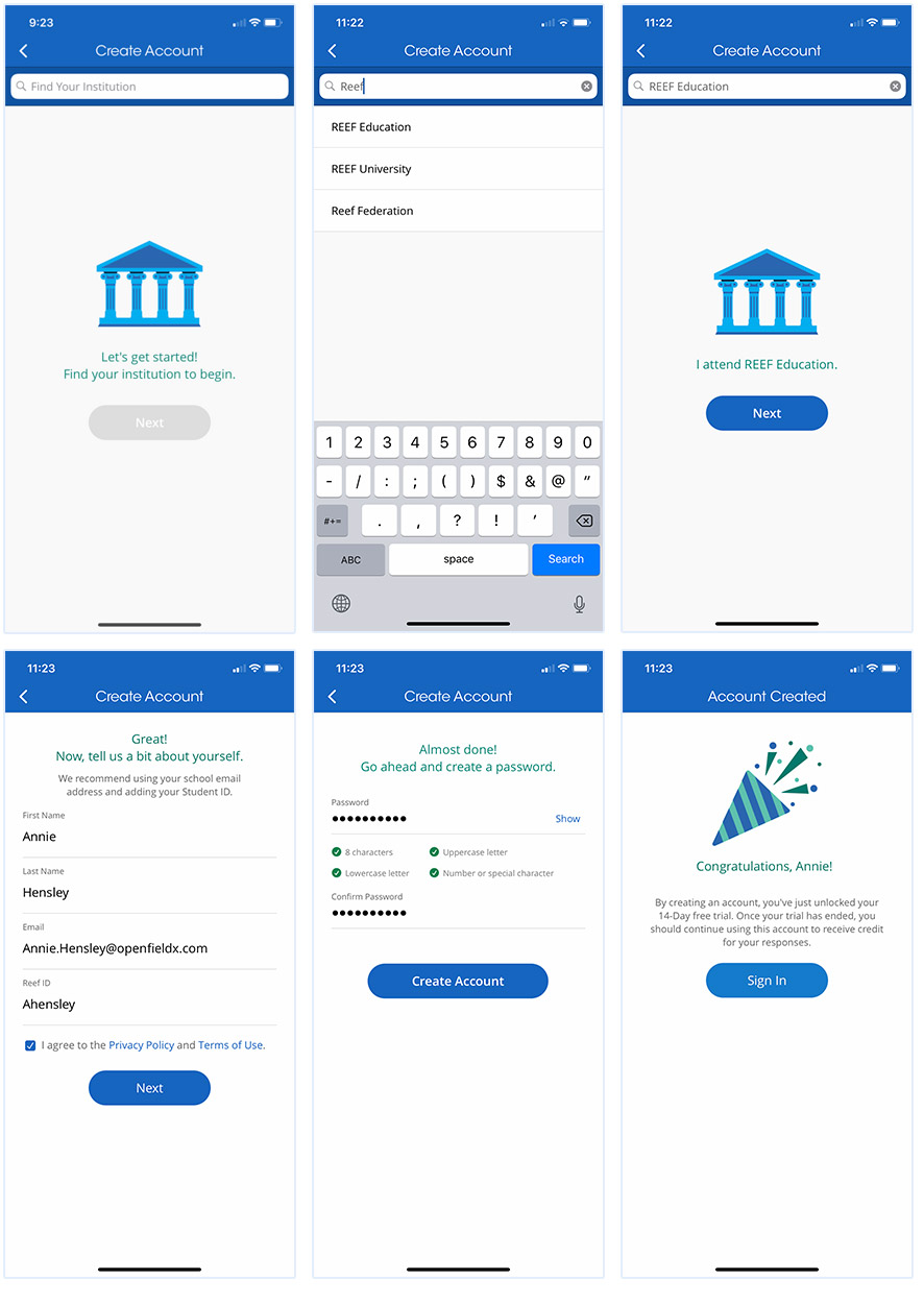
Onboarding in UX
No matter how well thought-out your product is, if it’s hard for people to learn to use it, they may become frustrated. Onboarding — the cues that you give to help users come up to speed — is an important first step in creating a great user experience. A poor onboarding experience can have a big impact on the overall satisfaction your users feel. Your product can work wonderfully and solve real challenges for users, but if they have difficulty getting started, your adoption rates will almost always suffer.
In EdTech, products typically address three main user groups: instructors, students, and administrators (we’ll focus primarily on the first two here).
When instructors decide to use a new tool, they’ll typically get to know its features and functions and complete the setup process before they introduce it in the classroom. The biggest concern in using an EdTech product is gaining confidence. Instructors want to command their classrooms on that first day, and don’t want to fumble with the app. As they get up to speed, they may reach out to your sales or customer service team for help — and that personalized white glove service can be time-consuming and costly. Products that provide a thorough in-app onboarding experience can build the user’s confidence and cut down on service calls.
For students, the onboarding process has to be straightforward. Remember that every time students run into a problems with the tool, they’ll go to the instructor; in a large classroom, those requests can become a real headache for educators. (In fact, instructors usually familiarize themselves with the student version of the tool so they can easily respond to questions.)
Administrators, either department admins or IT coordinators, also test-drive tools before they recommend them to their constituents. And some products are meant for admins to use that students and instructors will never see. Onboarding considerations apply to this group, as well.
Building a Better Onboarding Experience
When you’re working with an existing product, especially one with many prior releases, it can feel like a daunting undertaking to refine the onboarding experience for users. So we’ll share our best practices for helping users acclimate to your EdTech products:
- Onboarding is not something you just “slap on” your product.
In order to identify the “trip hazards” in your product, you need to conduct proper research and discovery, ideally in person. Members of your design and development team might attend the first day of class and observe the instructor and students. Look for where they struggle; for example, whether students forget their passwords or haven’t renewed their subscription to the app.
You might also sit with instructors and watch their pain points as they’re setting up the tool, or use interviews or journaling exercises to understand where they had trouble with setup or don’t understand how to use a feature.
Then, focus your onboarding improvements on those points: Identify a couple of tasks that users are tripping on and start by smoothing those over instead of trying to attack the entire onboarding process. It doesn’t have to be an all-or-nothing project; you can make incremental refinements over time.
- Are you walking first-time users through your application? Or introducing a new feature midstream?
Within the product, users may simply need help getting started by creating an account and setting up the product. Avoid introducing the entire suite of functions up-front, lest you overwhelm users. You might ask new users to complete a series of prioritized tasks step by step, telling them what each step is going to do for them.
You could institute a wizard to walk instructors through setup, but then they might get to the first screen and still need to complete specific tasks, like uploading a class roster. You can use the empty space on that page to communicate those instructions, with a ghosted preview of what the completed task looks like. On a grade book page, for example, you can tell users what will populate in the blank spaces or, if there’s an action they need to take to get that info to populate, tell them how to do it. (I’ve found the latter to be a better option than the former.) Use what we call “microcopy” to provide those instructions in place, such as: “You don’t have any students in your gradebook. Invite students to register now by sending them this link.”
Onboarding also happens midstream, when a feature users are accustomed to changes or there’s new functionality. In that case, a walkthrough may be helpful, or at least basic prompts that highlight what’s new. Popup windows with “did you know” tips can point experienced users to more powerful functions, or to newly introduced features in an upgrade: “Did you know that you can now ask students to signal their location when they sign in?”
- There’s no one way to incorporate onboarding features.
That’s because users are different. Their expectations are different. So you may need to consider multiple ways to help them learn how to use a product.
Look at how the gaming industry introduces games to players of various skill levels. As new players begin, the game essentially teaches them how to play as they go, simulating the action in a safe mode so they can’t lose or fail while they’re playing. As they level up, the game introduces new elements or options. EdTech products can borrow this technique to control the experience of learning a tool so that it feels enjoyable and not tedious. Look for ways to give the user a sense of control that builds confidence by introducing features and messages at the right time.
- You don’t always need to build from scratch.
If you are looking for a robust walkthrough onboarding solution, there are many customizable applications that already exist that could be integrated into your application. If your product is complex, you might consider adding an introductory function that essentially overlays the app and adds windows, pointers and other aides to help the user learn the tool step-by-step.
- You can go overboard with onboarding.
Onboarding should simplify a user’s experience. You need to prioritize what actions you want the user to take and when. Onboarding should guide users and provide clarity. It is easy to add too much detail and create a cumbersome process that gets in the way of your actual application.
- Onboarding happens within apps and software, but also outside of them.
Consider that the familiarization process starts when a prospective user visits your brand’s website or speaks with a sales rep to inquire about the product. Onboarding starts before the user even logs into the app. UX, Product, and Marketing teams all need to be in alignment when it comes to informing users about how to use a product.
You need to create a great experience for users during their first introduction to the product. This may be a marketing email (whose messaging should reflect what you want users to know). This could be a first interaction or demo with the sales team. There are also cases where users stumble upon your product with no context and create accounts. It’s important to have a unified message across all onboarding materials, so your users have a great experience no matter where in the journey they meet your product.
Improving the on-ramp to your product makes users confident in their choice and increases their satisfaction. And the bottom-line benefit of a better onboarding experience comes from both greater customer retention and reduced customer service.