Wiley Publishing: WileyPLUS Student Assignments
Multi-phase research and design drive high-impact improvements to the student assignment experience.
Student assignments are complex by design. When that complexity is amplified by technical constraints, retrofitted navigation, and poor information hierarchy, it results in a frustrating experience for students and instructors. Openfield harnessed the complexity into a focused experience that meets the needs of students and the business.
Great UX lets students and instructors focus on learning, not troubleshooting issues.
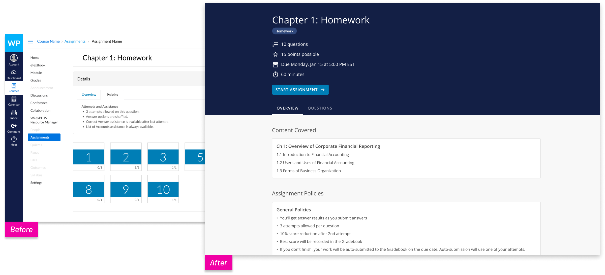
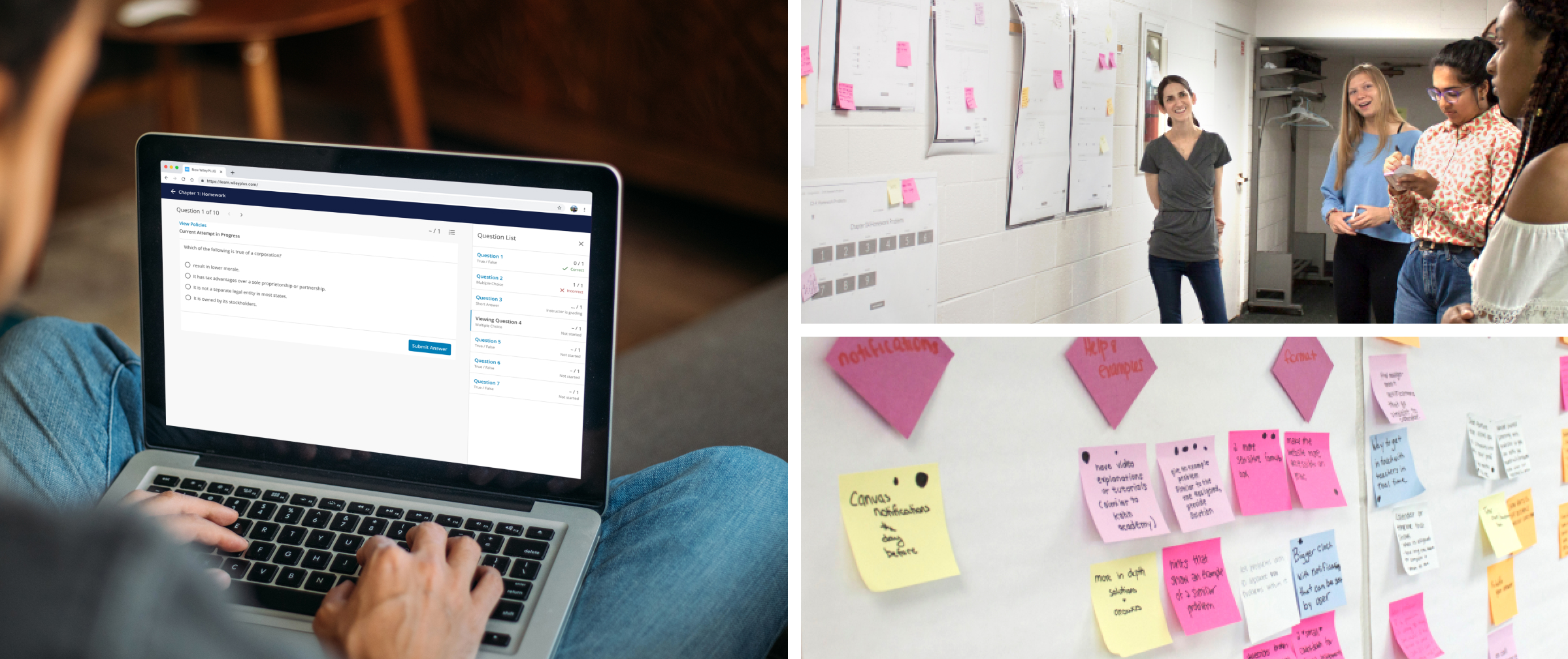
Students were overwhelmed by the Assignment View, leading to increased CX calls from frustrated instructors. Display of assignments was confined to an iFrame within the LMS, and students couldn’t differentiate which navigation was controlled by Wiley or by their LMS.
Openfield held co-creation sessions and interviews with students to understand their needs while taking assignments. They then helped the team convert the restrictive iFrame into a launchpad instead of a container for the assignment, which maximized screen real estate to meet student needs.
Students could now focus on completing assignments with renewed confidence that they had everything they needed to succeed. Instructors could focus on teaching rather than fielding complaints, resulting in fewer complaints to the CX team.
Reduced Student Anxiety During Assignments
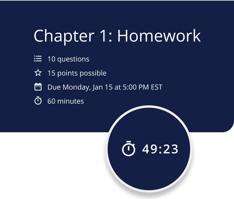
An updated cover page that sets clear expectations
Students had trouble finding and understanding how many questions an assignment had, how many points it was worth, or when it was due. They often could not tell how long an assignment would take until they started it — if it ran on limited time or limited attempts, students ran the risk of unwarranted penalties for late or incomplete assignments.
The updated cover page summarized all the information they needed, and now included a persistent timer that alerted students to the remaining time during timed assignments. Instead of stressing and wondering about the time they had left, students could plan their time and focus on the task at hand.
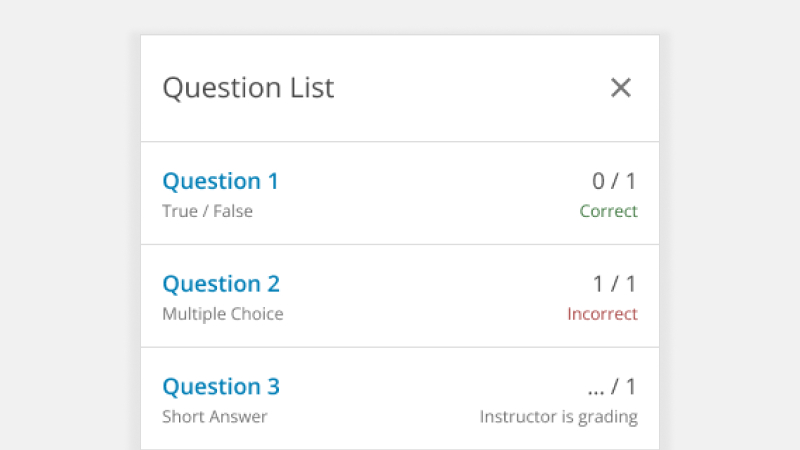
Streamlined navigation among questions within an assignment
To add another layer of assurance to the student assignment experience, a side panel was added. This panel is visible at any time in the assignment, and can be expanded to reveal the full list of questions an assignment contains. Not only would this allow students to move between questions and work in an order in which they’d be comfortable, but it also provided context for their progress through the assignment as a whole.
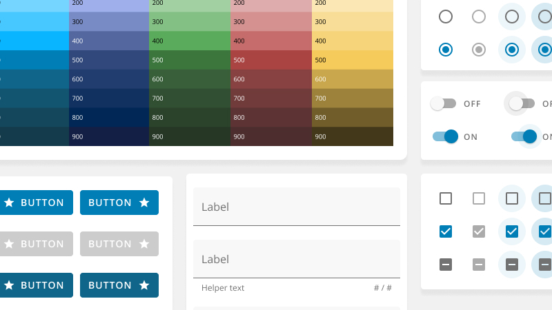
Modernized UI that felt familiar
Students thought the interface of the previous system looked outdated compared to other tools they were using at the time. It lacked a consistent visual design system. Around the time of this project, Wiley acquired Knewton Alta, an adaptive assessment product with a modern, streamlined interface. Openfield worked with the Knewton Alta team to create a refined UI that leveraged their design system. The team then used that system throughout WileyPLUS for additional consistency.
Instructors feel like it's their job to explain things to students, and when courseware isn't intuitive, it can be frustrating for everyone.
Building an Experience that Supports the Needs of Students
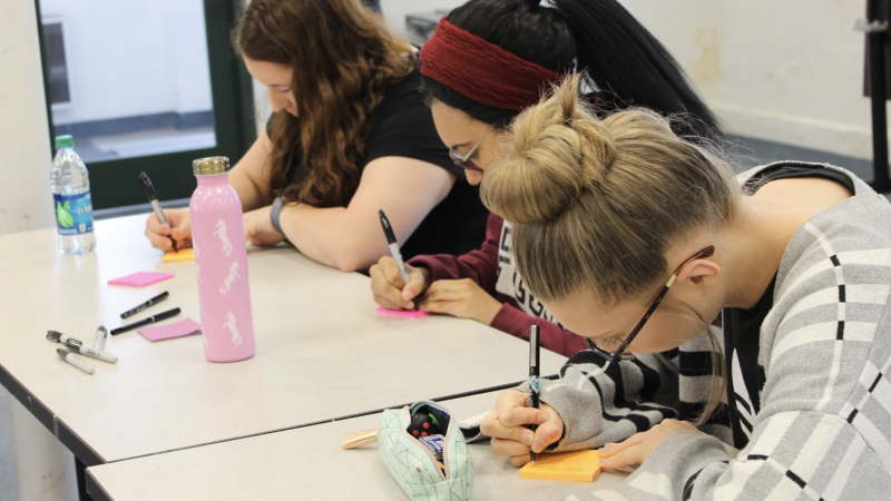
Co-creating new solutions directly with students
Openfield reached out to actual students to get a direct understanding of their assignments and the obstacles standing between them and a smooth WileyPLUS experience. We began with homework probes, where they answered questions about their experience doing homework in WileyPLUS. We then met with students for an in-person co-creation session, where we facilitated a gallery walk, experience mapping, brainstorming solutions, and finalizing solutions. The session helped the team understand how students felt before, during, and after the assignment experience.
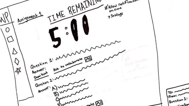
Design exploration expanded upon key student ideas
Sketches drawn by students during the co-creation session proved to be a helpful starting point. Openfield’s design team made wireframes and an array of concepts based directly on the students’ feedback. The Openfield and Wiley teams collaborated to assess the concepts and determine what was working and what wasn’t. We also made sure to address accessibility concerns that the product previously exhibited, such as ensuring that heading levels were consistent, alt text was present, and that screen readers covered the content in the correct order.
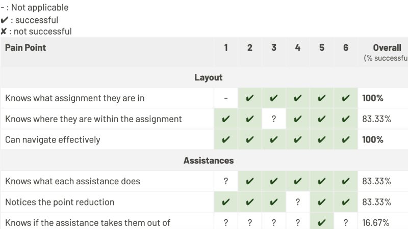
Validation helped focus and refine final designs
As the iterative process continued, the team conducted two phases of testing. Twelve students representing ten institutions and five disciplines participated in testing, which led to the final solutions.

About Wiley
For over 200 years, Wiley has been a global leader in helping universities, businesses, and individuals move between education and employment to achieve their ambitions. Wiley develops digital education, learning, assessment, and certification solutions that empower learners, researchers, universities and corporations in an ever-changing world. Their online scientific, technical, medical, and scholarly journals, books, and other digital content build on a long heritage of quality publishing.
Transform User Problems into User Delight
Most EdTech teams know something isn't working — but knowing what to fix, how to fix it, and in what order requires specialized expertise.
Pinpoint Real User Problems
Our Research & Testing services can help you pinpoint what's actually broken and why.
Learn MoreMake Confident Product Decisions
Our Ideation & Planning services help you prioritize roadmap updates with business justification.
Learn MoreDesign and Validate Before You Build
Our Design & Prototyping services help you reduce engineering risks and costly reworks.
Learn More