CASE STUDY: Macmillan Learning Design System

New design system reduces wasted time and unifies user experiences across the product suite

Macmillan Learning: Design System

New design system reduces wasted time and unifies user experiences across the product suite

Because Macmillan Learning’s suite of EdTech products were designed at different times by different teams, growing design debt was leading to duplication of internal efforts and inconsistencies in the user experience. Openfield analyzed the issues, created a plan and delivered a new living design system that unifies disjointed user experiences while enabling the product team to work more efficiently across the entire product ecosystem.

Reduced Friction for Instructors and Students

Different UI patterns were being used to perform similar tasks across products. Instructors were losing real time in the classroom due to the inconsistency.

The new design system established a standardized suite of UI components, design patterns and usage guidelines that enable consistency and flexibility.

The new single, unified design system is now used across seven Macmillan products, reducing friction among instructors and students across the ecosystem.

I don’t want to have to relearn different interfaces that do the same thing in different ML products that I use.

Guidance and Efficiency for Product Teams

Scaling changes consistently across Macmillan's products had become very inefficient and expensive for product, UX and engineering teams.

New component and pattern standards established a solid design foundation, while clear documentation clarifies design principles and usage boundaries.

Product teams no longer waste time reinventing component standards, freeing them to focus on complex UX solutions with more confidence.

Establishing a Living Set of Design Standards

Identifying a common design language

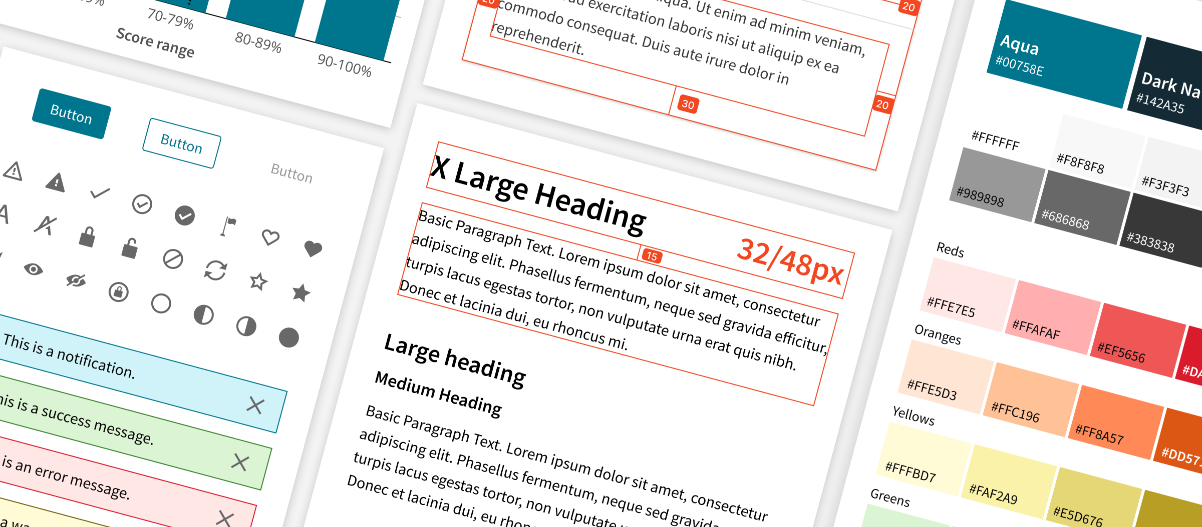
Openfield audited twelve Macmillan Learning products, assessing components, styles and UX patterns to reveal commonalities and differences. Informed by the audit findings and established brand standards, a Common Design Language (CDL) identified new UX guidelines for a range of product design considerations such as colors, typography, iconography and language.

Creating components for efficiency and accessibility

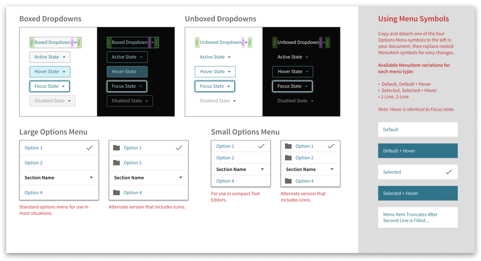
The CDL guidelines were then applied to a new, accessible design system: buttons, alerts, date pickers and far more were created, tested and refined to support the latest WCAG standards. The new system established a reliable foundation for UX teams to design efficiently and consistently for better user experiences.

Empowering teams through guidance

Clear, online documentation supported designers with usage principles and guidance. These new tools gave product teams the confidence to make sound decisions when designing across a wide range of UX contexts and use cases. Less time spent interpreting design standards meant more time available for focusing on more impactful solutions.

Collaboration in governing and evolving the system

Openfield worked as an extension of Macmillan’s UX design by supporting governance efforts with real-time guidance, feedback and discussion. New questions and needs were assessed as they arose, and a continuous release approach allowed for ongoing evolution of the guidelines — mirroring the product development process itself.

Documentation That Emphasizes Efficiency and Quality

Usage Guidelines

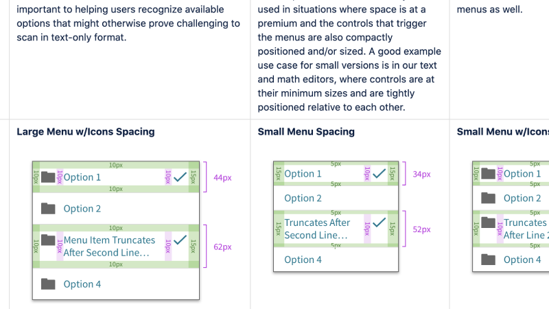
Component specifications were supplemented with usage examples and guidelines to assist the UX team in making smart, efficient design decisions. Removing uncertainty about how components can be used, combined and modified improves team efficiency by freeing them up to focus on more complex problems.

Guiding Design Principles

Guiding principles were created that articulated the core attributes that act as identifiers of a Macmillan Learning product. This guidance helps the team remain familiar with key values when extending the system into new usage scenarios.

BEST PRACTICE

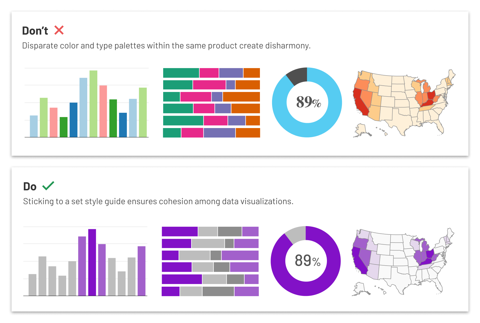
Why your EdTech product needs a data visualization style guide

As EdTech products mature and grow, they accumulate more and more of something else: User data. This ever-expanding river of data represents a major opportunity to add value for your users by uncovering meaningful and actionable insights.

How you go about presenting that data can spell the difference between success and failure.

About Macmillan Learning

Based in the US and Canada, Macmillan Learning partners with the world’s best researchers, educators, administrators, and developers to deliver sound pedagogical EdTech solutions. Their robust suite of educational technology products is designed to facilitate teaching and learning opportunities that spark student engagement and improve outcomes.

UX Capabilities at Openfield

User Research & Testing

Focus all stakeholders and team members on what really matters to your users. Make more confident decisions about what you deploy and when.

Learn More

Ideation & Planning

Align product features and flows with the real-world wants and needs of student and instructor users.

Learn More

Design & Prototyping

Create and validate bar-setting user experiences that will endear students and instructors to your product.

Learn More

Spread the word