As EdTech products like yours mature, they grow. That is, they amass an increasing number of features, functionalities, and users. And as they do that, they create and collect more and more of something else: User data. This ever-expanding river of data represents a major opportunity to add value for your users by uncovering meaningful and actionable insights. But how you go about presenting that data can spell the difference between success and failure.
With the volume of data steadily mounting, EdTech companies must find ways to tell data-driven stories that engage and inform users. Of course, data visualizations are often the best way to do that. But you can’t just slap a chart or graph in your product whenever the opportunity arises and expect to create a consistent user experience. You must start with a data visualization style guide — a set of standards defining the way you design and build your data visualizations.
This vital asset should be more than just a collection of charts and hex colors. It should be a robust resource that documents and refines your overarching data strategy, guides your team in creating thoughtful and consistent data visualizations, and speeds up your design process. Here’s how.
Aligning data visualizations to an overarching color and type palette creates cohesion within the product.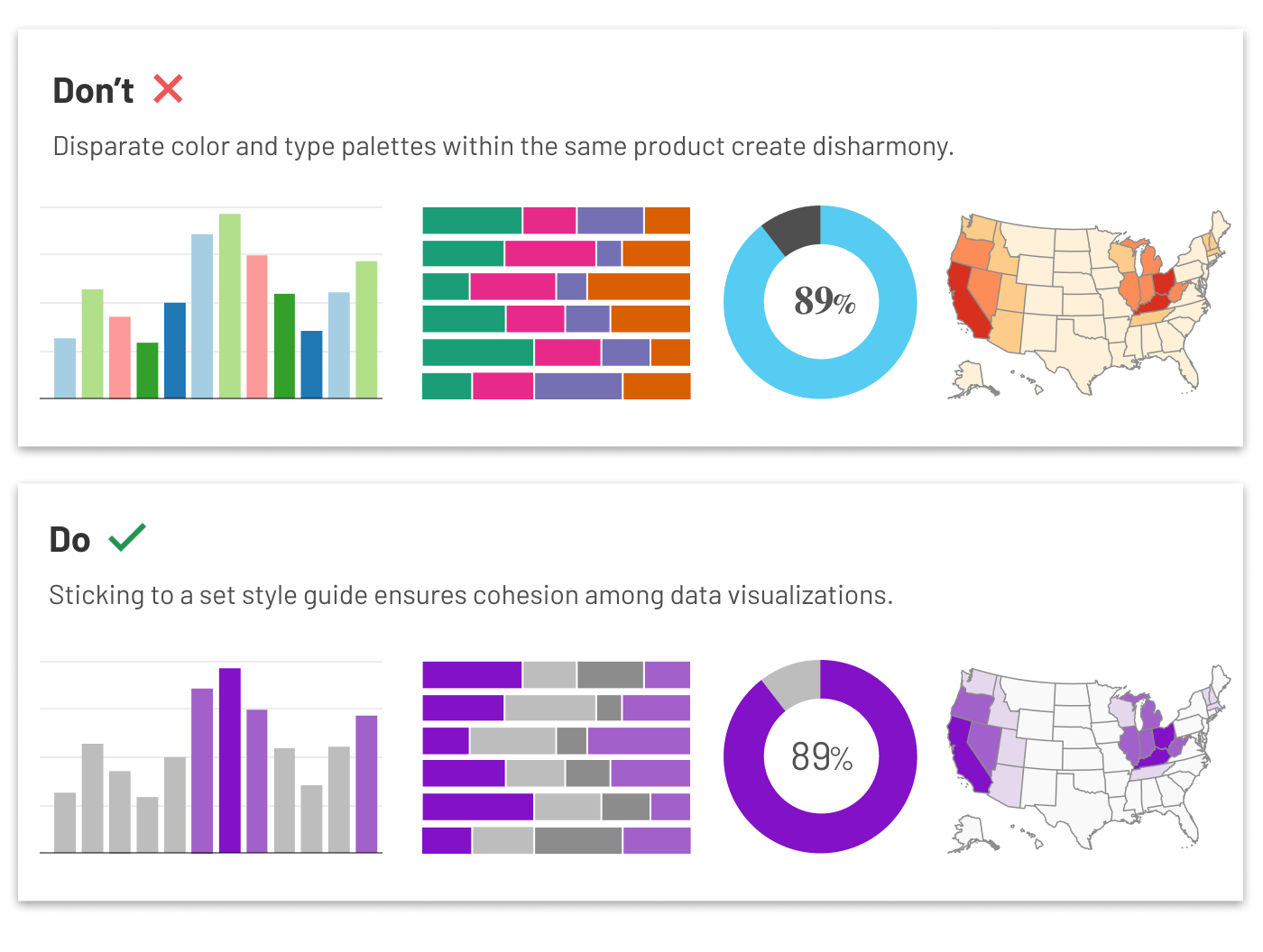
What is a Data Visualization Style Guide — and What Should It Contain?
As the name implies, a data style guide is a set of rules and guidelines that governs how your EdTech product’s data visualizations are built, styled, and presented to users. This includes elements like:
- Chart types (including information about which chart types are best suited to which kinds of data)
- Branded color palettes
- Typography
- Icons
- Text (such as labels and legends)
- Accessibility considerations (such as keyboard alternatives, metadata for screen readers, and high-contrast color schemes)
- Interactions, animations, and behaviors
- Touch gestures
Taken together, these elements give designers a comprehensive and holistic understanding of how your EdTech product’s data visualizations should be handled.
However, even with all of these details, it would still be possible for designers to create data visualizations that are all beauty and no brains. To create truly meaningful data visualizations, designers must start by understanding their data (what it describes and any key takeaways) and their users (what questions they are asking that can be answered by the available data).
Because that’s true, the best data visualization style guides go one step further. They provide strategic guidance for designers by laying out a set process to follow or a series of questions to ask. The purpose? Prompt designers to consider both their users and their data before selecting a chart and building a visualization. By baking a strategic process into the style guide, designers can align around a shared process for defining the why behind each data visualization.
The Benefits of a Data Visualization Style Guide
Take a look at your EdTech product and ask yourself: Do you have data visualizations scattered about your product without any real harmony among them? Are you handling data consistently, or is each visualization its own, unique one-off creation? And do your team members find themselves recreating the wheel every time they produce a new data visualization?
These questions describe common data visualization problems that many EdTech companies bump up against. In doing so, they underscore the risks of producing data visualizations without a specialized style guide. Your existing product style guide or design system won’t cut it. Data visualizations have too many unique elements and challenges for that.
You need a data visualization style guide for the same reason you need a design system: to ensure consistency within your product or product suite. But the benefits go beyond consistency. By building a data visualization style guide for your EdTech product, you can:
- Maintain your product’s uniform look and feel
- Speed up the design process
- Formalize an overarching strategy for reporting out data
- Deliver a first-rate user experience
- Ensure your data visualizations meet accessibility requirements
- Lend credibility to your data and product
That last one is worth reiterating. If your data visualizations are inconsistent, your users won’t just suffer from a mediocre (and possibly confusing) user experience. They will also lose trust in your data — and, by extension, your product.
Creating a library of commonly used data visualizations can speed up the production process, both for designers and developers.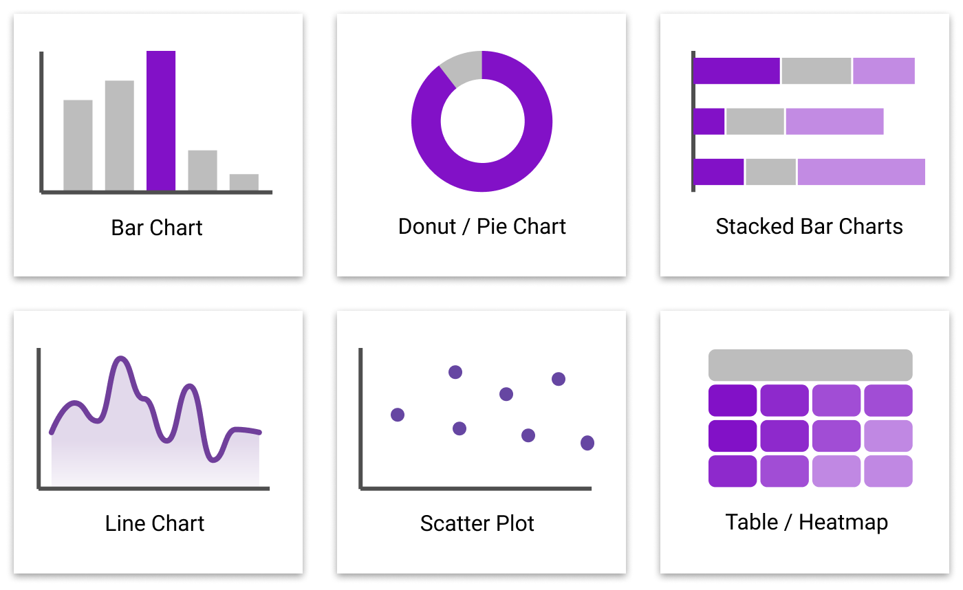
How to Build a Robust Data Visualization Style Guide for Your EdTech Product
Ready to take your EdTech product to the next level by creating a data visualization style guide? Take these steps to get started.
- Assign ownership of the project. Appoint someone on your UX team to take ownership of your style guide project. This person should lead the charge in preparing, testing, and distributing your data visualization style guide.
- Get input from internal stakeholders. Work with your designers, developers, and other key stakeholders to determine what they need from a data visualization style guide. What would make their lives easier? For example, a developer might want to see plug-and-play modules of code that can be easily hooked up to the data without having to go back and forth with the designer about each element.
- Consider accessibility issues. What do your designers need to keep in mind when it comes to making data visualizations accessible to all of your users? Baking these best practices into your style guide ensures consistency and standardization.
- Document your data types. Document all of the different data types (and sources) your product currently collects. What does each type of data report on, and what can it tell you? For each data type, define the language your team should use to describe it in a data visualization. If you want certain types of data to be handled a certain way (such as with a bar chart), make sure to include those details.
- Talk to your end users. Before setting your standards and guidelines in stone, talk to your end users. Run your preferred data visualization style by your users and make sure they are able to clearly “read” and understand them.
- Test your design system on your internal team. You are used to thinking about user testing in terms of your end users. But when it comes to your design system, your internal stakeholders are your end users. Ask them to perform a series of tasks using your newly minted design system and see what questions or challenges they run into. Doing this can help you refine your design system and ensure it accounts for all of your current use cases.
- Keep your style guide current. Finally, remember that your data visualization style guide is a living, breathing document — one you’ll need to update continuously as new data types, technologies, and brand guidelines emerge.
As your EdTech product grows more and more data-rich, you have a critical opportunity to bring new insights and value to your users. By investing in a data visualization style guide now, you can pave the way for impactful and valuable data visualizations for years to come.