Article
EdTech Growth Series | Part 3: Design collaboration that accelerates development
In growing organizations, the relationship between design and engineering teams can make or break product development. Many companies start with strong engineering teams and bring in design expertise later. As EdTech products scale, lurking usability problems become emergencies that tax customer support teams and divert engineering teams away from the roadmap.

Project-Based Engagements
Openfield helps early-, mid-, and mature-stage EdTech companies quickly identify and eliminate barriers that keep their products from reaching their full potential. Project-based engagements typically run between two to six months in duration. The majority of new relationships with product teams begin with a project to address a specific challenge with a clearly defined scope, […]

EdTech Rapid Prototyping Package
Rapid prototyping is a cost-effective, resource-light approach to getting real-world feedback from users. Whether your product is brand new or you plan to release a significant feature revamp to a product with an existing user base, working iteratively through a rapid prototyping process allows your team to gain confidence that your ideas will truly solve […]

Ongoing Monthly UX Design & Research
Whether you’re an early-stage product with no internal UX staff, a mid-stage growing product with a small team, or an enterprise-level product, Openfield provides a strategic and tactical power boost to your UX program. Openfield specializes in UX research and design for EdTech product teams. Since 2006, we have been working with teams like yours […]

Article
Getting out of design debt with an actionable UX audit
Products, like people, don’t always age gracefully. When it comes to digital products, this aging process begins as soon as new features or bug fixes are introduced and it accelerates when you’re consolidating multiple products into one platform. Over time, as more and more changes take place, design debt (or internal inconsistencies that don’t match the product’s underlying design system) naturally begins to accrue. From minor visual discrepancies all the way up to broken functionalities, design debt fragments and undermines user experience.
Resource
Not sure which prototype to use? Here’s your guide to strategic prototyping.
Prototypes are essential tools to ensure efficient, cost-effective and ultimately successful EdTech products. But how do you know which prototype to use for every scenario? Our guide demystifies the process of choosing the right type of prototype with a detailed tour through the different stages—from initial paper sketching to functional iterating.

Article
Motivational design: a new perspective on gamification in UX design for EdTech
Gamification is a term that comes up frequently in user experience (UX) design. It’s a method whereby designers borrow design principles from video games to create products that are more intrinsically enjoyable to use. Think Duolingo: it’s a language-learning app with game-like features that keep users motivated to become fluent in a new language.

Interactive modules redesigned to meet learning objectives on any device.
Macmillan Learning: Interactive Modules Interactive modules redesigned to meet learning objectives on any device. Using pedagogical learning objectives as our consistent guide, we designed accessible, interactive modules from the ground up. The goal was to provide a rich, exploratory learning experience that supported a wide range of user needs.
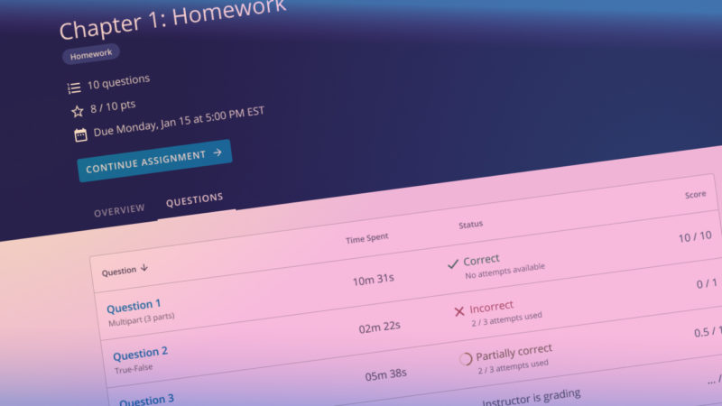
Multi-phase research and design drive high-impact improvements to the student assignment experience
Wiley Publishing: WileyPLUS Student Assignments Multi-phase research and design drive high-impact improvements to the student assignment experience. Student assignments are complex by design. When that complexity is amplified by technical constraints, retrofitted navigation, and poor information hierarchy, it results in a frustrating experience for students and instructors. Openfield harnessed the complexity into a focused experience […]

Article
Is microlearning the secret to engaging your EdTech product’s users?
Successful EdTech product teams do more than design a product that’s easy to use; they design products that support learners’ goals. And the only way to support learners’ goals is to know the learners themselves. That’s a continual challenge as users’ needs, priorities, and preferences are always shifting. Post-pandemic, it’s clear that learners won’t automatically return to any well-worn paths. They’re more interested in blazing their own educational trail, shaped by their own unique goals. People have discovered facets of their lives — including education — are more malleable than they once thought.

Resource
5 tips to manage design debt
Design debt — the natural accumulation of design-related inconsistencies — has a way of compounding over time, just like interest on a loan. And, like all debts with compounding interest, it can pretty quickly get out of control. If you don’t take it seriously, design debt can add up to poor performance of your EdTech product and unnecessary friction in your user experience. Use the 5 tips in this free guide to help your team skillfully manage design debt — and protect your bottom line.

Article
EdTech products must meet the needs of hybrid classrooms. UX can help.
The COVID-19 pandemic turned the traditional in-person classroom experience on its head. Students were suddenly remote, and instructors scrambled to continue teaching. While most students have returned to the classroom, the hybrid model — where some students are in person and others are remote — is likely here to stay. And that brings a series of unparalleled challenges and opportunities for EdTech products. This evolution of the traditional classroom offers great freedom and flexibility for both instructors and students. But it also presents new problems for teaching and learning. Effective UX design can help defray pain points and create products that are valuable for all users — whether they’re in-person or remote. For your EdTech product to have a lasting impact, it must accommodate the realities of the hybrid classroom.
Resource
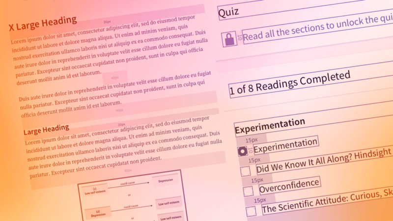
Download this Design System Starter Kit to create seamless user experiences more efficiently
UX teams often view design systems as luxuries they can’t afford. But an effective design system is much more than a “nice-to-have.” It can increase efficiency, save money, and shift your team’s focus to creating delightful new features rather than untangling design knots. While the idea of building a design system may seem daunting, our guide will help steer you whether you’re starting small or jumping in feet-first.

Article
Incorporating a UX mindset in your EdTech product’s course templates leads to better learning experiences. Here’s how.
In EdTech, your product and UX teams share a purpose: meeting the evolving needs of your users. You may be more likely to invest in improving the UX of the visible, user-facing parts of your product. That makes sense — it affects the bottom line. There’s no denying what students and instructors immediately see (like attendance, grades, and assignments) influences what EdTech product is purchased by or for them. These user-facing elements are made with internal course building tools, yet you probably make far fewer investments in them. From a UX perspective, this is a mistake. Internal tools — like the ones that build course templates — powerfully shape users’ overall experience with your product.

Article
Turn instructors into EdTech product champions with exceptional onboarding
EdTech users expect more of your product than ever before. Not only does your product need to be easy for users to navigate, but it also must facilitate a superior learning experience. UX (user experience) and LX (learning experience) add up to a truly valuable EdTech product in today’s classrooms — and not just for students. It’s important for your team to remember that instructors are learners, too. Instructors need to feel comfortable and confident with your product. And ideally, they will be convinced of your product’s role in the achievement of learning outcomes. Your team needs to prioritize instructors’ engagement with your product — and prove it with exceptional instructor onboarding.

Rapid adoption of digital transformation leads to the world’s top student engagement system
iClicker Rapid adoption of digital transformation leads to the world’s top student engagement system. iClicker came to Openfield with a vision to create a digital experience that would improve on its already pervasive handheld remote devices. The resulting experience quickly led to market dominance by giving instructors new ways to engage with their students who […]
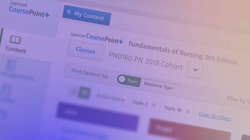
Research leads to design improvements that better align to how users think and work.
Wolters Kluwer Health: CoursePoint+ Research leads to design improvements that better align to how users think and work Openfield helped Wolters Kluwer uncover a serious issue that was causing user friction in their product, CoursePoint+. By realigning the user experience to mirror how instructors think and work, we eliminated user frustration and increased satisfaction. In […]
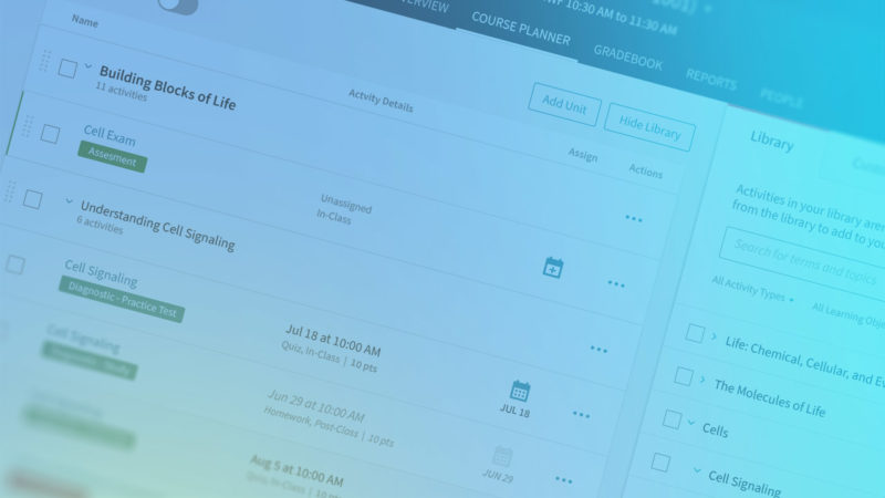
New design system reduces wasted time and unifies user experiences across the product suite
Macmillan Learning: Design System New design system reduces wasted time and unifies user experiences across the product suite Because Macmillan Learning’s suite of EdTech products were designed at different times by different teams, growing design debt was leading to duplication of internal efforts and inconsistencies in the user experience. Openfield analyzed the issues, created a […]

Article + Video
Want to increase trust in your EdTech product? Reduce cheating.
Cheating is a perennial concern in education. All educators are aware of it, and all educators know they must monitor students’ behavior for signs of troubling activity. But in an increasingly remote and digital context, sussing out cheating is harder than ever. Instructors are generally savvy to the ways students game digital systems. But that doesn’t necessarily make those deceptive activities easier to spot. More and more, instructors are looking to EdTech products to help solve the problem.

Article
Keep your EdTech product team on the cutting edge by creating an informed, forward-thinking culture
As an EdTech executive, it’s your job to think big picture. That means keeping your broader business objectives top of mind. And it also means staying in the know about industry trends. To that end, you may follow a curated news feed or participate in industry-specific LinkedIn groups. Doing so helps you stay on top of current events, trending technologies, and industry forecasts.

Article
Moving to a new design tool? Time to optimize your design system.
As an EdTech product owner, you know that your team is only as efficient as the systems and processes you put in place to manage production. And those systems and processes are, in turn, shaped by the design and engineering tools you use. That’s one of the reasons why the decision to migrate to a new design tool is such a big deal. But it also means that switching tools — for whatever reason — represents a key opportunity to reevaluate and optimize your workflows.

Article
How to prioritize user needs as your product team tackles feature requests & business demands
As a product owner, you’ve been trained to put your users’ needs first. But you also know from experience that you don’t have the luxury of developing EdTech products in a vacuum. While your users should ideally drive everything you do, you must also contend with a host of competing pressures, from budgetary constraints to compressed timelines. The truth is that your feature requests and production timelines are often driven by business needs. But your users are the reason you created your product in the first place.

Article
Evaluate your UX design tools to amp up efficiency and innovation
Your EdTech company’s UX team relies on digital tools to do their jobs, from design work and prototype creation to UX testing and managing internal workflows. Chances are, your team is fully dialed into a suite of tools that works reasonably well for them. Sure, your tools aren’t perfect. But the familiarity you’ve gained with them enables your team to create smooth, efficient workflows. Or do they? Stop and look a little closer. Your team may be using more workarounds than any of you realize — workarounds that are so deeply ingrained they no longer even seem like workarounds.

Article
Design systems can make or break your EdTech product’s UX. Here’s how to do it right.
You already know that design systems are critical when it comes to creating consistent user interfaces. In fact, you may already have invested in a design system for your EdTech product. You’ve seen some benefits, sure. But you’ve also found that it’s opened up a whole new Pandora’s box of sticky design questions. Rather than arming your team with the information necessary to make confident decisions, they are frequently bogged down with uncertainty and indecision. It seems like every new use case results in a debate over which version of a component should be used or whether new variants should be created.

Article
How to host a remote discovery workshop — and get the most from your EdTech team
When your team decides to build a new feature for your EdTech product, you likely start by holding a discovery workshop. You use the workshop to bring all the necessary stakeholders together, brainstorm ideas, and come into alignment about the underlying user needs and business objectives driving the new feature. The mechanics of putting on a virtual discovery workshop may seem overwhelming. But with a little planning and a few best practices, you’re sure to get the most out of your team — wherever they are.

Article
COVID-19 is stress-testing EdTech Products. Will you meet the demand?
The coronavirus pandemic continues to rapidly change (and challenge) the world in myriad ways. With social distancing a must for the foreseeable future, educators around the globe are scrambling to migrate to online learning. As a product leader at an EdTech company, you are in a unique position to help educators and students in this tumultuous situation. Chances are you’re already doing just that by offering your product free of charge for the duration of the pandemic.
Article
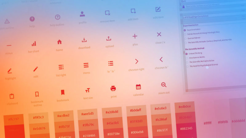
How to build an EdTech design system that supports multiple products
Most EdTech companies understand the value of design systems. Comprehensive UX design systems are much more than just a static library of fonts, colors, and reusable components such as buttons. Actionable design systems also establish principles to guide the usage of individual components. The result is improved efficiency, more effective design governance, reduced design debt — and a more user-friendly product.

Article
Want to increase product engagement? Expand your UX to include sensory cues.
Our best experiences outside of the digital world are made up of much more than what we can see. Think of walking in the woods, petting a dog, or eating a warm, flaky croissant. These real-world experiences engage all of our senses — not just sight — to create meaning and elicit delight. However, most digital experiences revolve around just one of our senses: sight. No surprise there.

Article
How superior onboarding wins over EdTech users from sales to product evangelism
Using a new product for the first time is a little bit like meeting a new friend or coworker. In fact, users assess new products in much the same way we assess new people: with personality, looks, and ease of interactions all coalescing to form a positive or negative association. Those initial interactions quickly add up to a powerful first impression — one that can be hard to dispel over time.

Article
Want to reduce student anxiety and increase enthusiasm? Great UX is the answer.
Most digital products, such as social media, budgeting, and news apps, appeal to users on the basis of their utility or entertainment value. Individual users make the personal decision to purchase or download these products because they want to use them. EdTech software, on the other hand, is different. They are undoubtedly useful. But for student users, they may not seem like much fun when they are required to use them.

Article
2020 Trends in EdTech UX – What product leaders should expect in the coming year
Being a great product leader requires a constant balancing act between meeting the need to release immediate improvements while simultaneously planning for what’s coming in the next year and beyond. Dealing with today’s concerns, such as Accessibility compliance and onboarding issues, has a way of getting in the way of planning for bigger trends that will have an impact on the success of your product.

Article
Are your UX design and research teams working in lockstep?
The best EdTech products, the ones that instructors, students, and administrators value most, are those that truly anticipate and meet their users’ needs. Developing a product with a superior user experience requires the right UX expertise, of course. But that’s not all. Your product’s usability also depends upon how well your product team coordinates and collaborates during the development process.
Article
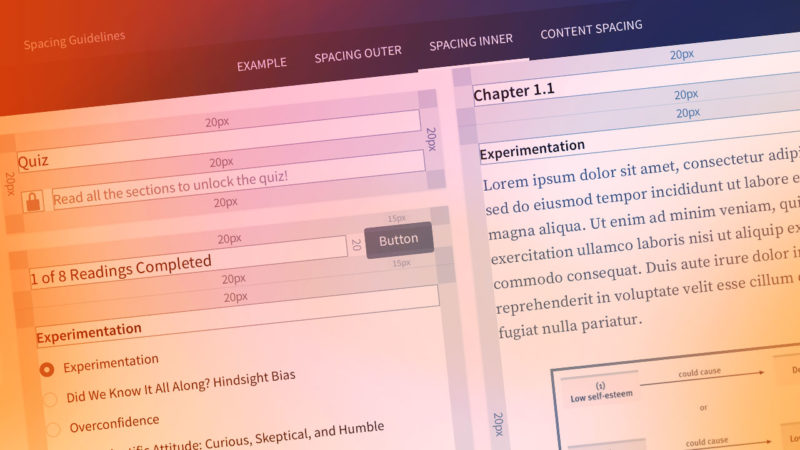
Why a design system should be a core part of your product roadmap
Within any product, there exists a large set of individual design elements, from buttons and colors to menus and form fields. Together, these individual elements make up the basic building blocks of a product’s design. Design systems are the means by which product teams document those individual components, describe how they behave, and provide usable guidelines for how to build patterns and workflows. Many product teams write off design systems as being superfluous.

Article
The high costs of design debt – and how to pay it down
Usability problems can crop up in EdTech products for any number of reasons. An incomplete understanding of user’s needs. Inadequately defined product requirements. Insufficient user testing. The list goes on. Many of these issues can be headed off simply by incorporating UX and user-centered design best practices in the product development process. But no matter how attentive your team is to its users, and no matter how airtight your approach, there’s another usability problem that is sure to materialize with time: design debt.

Article
The purpose of UX discovery sessions – and how to make the most of them
When we begin a UX engagement with a new EdTech client, our first priority is to quickly learn as much as possible about our client’s product and users. Our collaborative process begins with a phase of research and user understanding that includes an in-person discovery session. The discovery session allows a products’s stakeholders to identify problems, clarify goals and priorities, and align around a shared vision for their product – before identifying solutions. Here’s what you need to know about this critical planning session — and how you and your UX team can make the most of it.

Article
Why your engineering team should regularly attend your user testing sessions
When your engineering team is in the midst of an agile development sprint, they must be laser-focused on the tasks that comprise the next leg of their work. That sort of tunnel-vision is a good thing. Good, that is, so long as it’s tempered with an appreciation of your users’ needs. You see, unless engineers intentionally approach their work from an empathetic, user-centric perspective, they will naturally prioritize technical limitations and considerations over other factors — sometimes at the expense of user needs.

Article
Investing in UX: How to structure your UX budget for maximum ROI
When product teams put together budgets for new products or product releases, they often struggle to determine how much money to allocate for UX research and testing. This confusion flows from uncertainty about how to view UX’s role in the product development process. Is UX a one-time project with precise parameters and a predictable scope, like designing a logo? Or is it an ongoing program of activities that ought to be woven through the entire development process?
Article
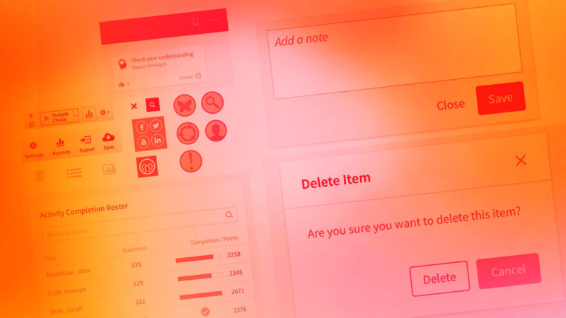
Top 10 tips to produce effective, user-friendly microcopy
Chances are, your product team already pours ample resources into making your products as user-friendly as possible. You work hard to get the user flows and UI elements just right. But what about the verbal components of the interface?
If you’re like many EdTech companies, microcopy — or the many verbal cues found throughout your product, from buttons to prompts and instructive overlays — may be a last-minute consideration. This often means that microcopy is written on the fly, without rigorous guidelines or user testing.
Article
5 tips for integrating third-party applications without sacrificing the user experience
Over the past few years, the UX of EdTech products has improved by leaps and bounds. That’s true at the individual application level, anyway. But it’s a whole different story when you look at the user experience of product integrations that bridge two or more applications. It’s hard enough to integrate platforms in situations where you have complete control, but it can be incredibly difficult to integrate third-party platforms in a meaningful, seamless fashion.

Article
Daily Design Reviews: An evolved design review process fit for the complexity of EdTech products
At Openfield, we found that the same old design review process didn’t quite fit the bill anymore. Instead of formal, infrequent design reviews, we needed to develop a design feedback loop that was as agile and iterative as the development process itself had become. And that’s how we landed on a system of daily design reviews.

ARTICLE
‘Good enough’ usually isn’t: Avoiding traps that sabotage MVP success
Minimum Viable Product. Minimum Awesome Product. Minimum Loved Product. No matter what you call it, your product needs to delight users on the first release and every iteration beyond that, or it will fail.

Article
UX research methods (part I): Avoiding user bias with observational user testing
User testing is a crucial component of successful product design. Without the insights that on-the-ground testing yields, designers can only guess at how users will actually interact with their products.

Article
Inclusive design: why EdTech companies should go beyond compliance
Truly inclusive product design aims to create products that work seamlessly for all people, in all situations. This may seem like a tall order, but it really should be your company’s goal. Not only is it an ethical imperative, but it’s good for business, too.

Article
Avoiding Dependency Hell as product teams scale
For EdTech companies, the opportunity to develop single, enterprise-wide products is both exciting and potentially lucrative. But with bigger projects come bigger challenges throughout the UX process. With multiple UX teams, product teams and engineering teams all functioning separately within the same project, building products at a large scale opens a web of complex communication issues for the teams involved.

Article
How CX and UX come together to meet users’ needs and inspire loyalty
A harmonious integration of customer experience (CX) and user experience (UX) is especially important in EdTech, where educational IT managers and instructors have become accustomed to not just strong products, but also to comprehensive, personalized service.

Article
Borrow cues from search, retail, gaming to improve UX in EdTech products
From administrative tasks like taking attendance and grading quizzes to features that enable students to learn and succeed, EdTech products have become more and more powerful. But that power can make these tools more complicated for users. Learn how to align tools with common mental models from search, retail, and gaming.
ARTICLE
How onboarding helps users get up to speed on your EdTech products quickly
Improving the on-ramp to your product makes users confident in their choice and increases their satisfaction. The bottom-line benefit of a better onboarding experience comes from both greater customer retention and reduced customer service.
ARTICLE
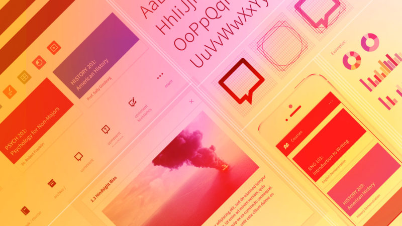
Evolving your design system over time improves team efficiency
Often, design systems are treated as “one and done” initiatives — drafted, agreed upon and set in stone. Many a design team has embarked on a fool’s errand, thinking they could anticipate every design need that may arise in the future. If you instead adopt a continuous release approach for ongoing improvements to guidelines, you essentially mirror the product development process itself.

ARTICLE
In EdTech products, friction can be good or bad. A balance of both is the answer.
User journeys through apps, software and websites must follow optimized paths with no confusion or distractions.

ARTICLE
UX is not a one-time event. What EdTech product leaders need to know about the cost of inaction.
Keep it active … or face the consequences. While many organizations make the commitment to implement UX practices, we’ve found that many adopt best practices of UX only to a point.

ARTICLE
User experience really does mean all users, part 3
While achieving compliance in your digital products is important, it’s a first step. Make it your goal to reach ALL users through the practice of inclusive design

ARTICLE
User experience really does mean all users, part 2
It’s important for EdTech product teams to embrace industry guidelines and best practices around accessibility. The web and technological advances create new opportunities and have the potential to remove communication barriers many face in the physical world. Yet millions of people can’t fully reap the benefits of those opportunities because of inaccessibile digital products.

ARTICLE
User experience really does mean all users, part 1
Governments (including the United States) have made strides in implementing or updating regulations and policies that ensure that people with disabilities do not face discrimination and have equal access and opportunity to use the web and digital products. While regulations provide a baseline, industry guidelines can provide more context and direction for accessibility in UX. Features like screen readers, text-to-speech, closed captioning and sticky keys are commonplace thanks to established industry guidelines.

ARTICLE
Three ways research improves UX outcomes
Research is the foundation of best-practice UX, leading to gains that can be transformative for digital products. But all too often, product teams either forego research altogether, or they fail to implement it properly.