
More Data Shouldn’t Mean Less Clarity: How we helped MIT Libraries find focus through framework design.
MIT Libraries Framework More data shouldn’t mean less clarity: How we helped MIT Libraries find focus through framework design. When MIT Libraries found themselves with extensive user research across their many systems — including their library home page, Bento, Primo, and numerous departmental tools — but no clear way to prioritize next steps, they partnered […]
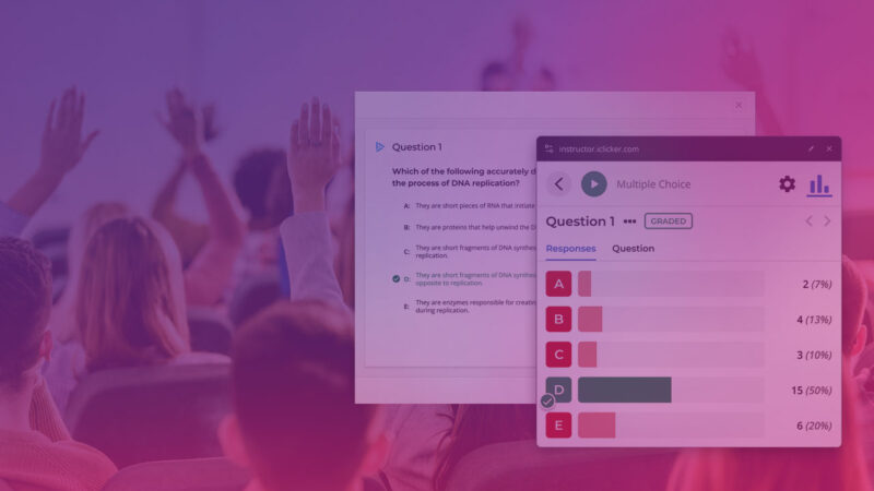
iClicker’s new AI Question Creator – our staged approach results in a faster, more confident launch.
iClicker AI Question Creator How our staged approach to rapid feature development resulted in a faster, more confident launch. When Macmillan Learning wanted to experiment with AI-powered question generation for their iClicker platform — a leading in-class engagement tool that helps instructors create interactive polling experiences and gauge student understanding in real-time — they needed […]

Article
What’s the Difference Between User Journey Maps, User Flows, and Task Flows in EdTech Discovery?
When product leaders begin a partnership with an outside UX team, the discovery process presents a unique challenge. All stakeholders must gain alignment about the product problem to solve and come to a shared understanding about your users. And in order to understand your users, you need to consider their flows. Task flows, user flows, and user journey maps can all be useful in the UX discovery phase. All of these tools share a sense of establishing and tracking user movement. But they are discrete tools that have specific purposes and appropriate uses. You should know what outcomes each of these three tools provide, how they overlap, and how they support each other. That way, you’ll know where your efforts will be best applied in our discovery work together.

Article
What UX Research Strategies Do Growing EdTech Companies Need?
As EdTech companies mature, they inevitably look to grow their user bases. When you find yourself at such an inflection point, it’s more critical than ever to refine your research, design, and development processes to ensure you don’t create or compound your UX problems. In this first article in our series on optimizing your UX program to enable smooth growth, we’ll examine what this means for your research process.

Article
Effective UX research lays the foundation for strategic growth
As EdTech companies mature, they inevitably look to grow their user bases. When you find yourself at such an inflection point, it’s more critical than ever to refine your research, design, and development processes to ensure you don’t create or compound your UX problems. In this first article in our series on optimizing your UX program to enable smooth growth, we’ll examine what this means for your research process.

Ongoing Monthly UX Design & Research
Whether you’re an early-stage product with no internal UX staff, a mid-stage growing product with a small team, or an enterprise-level product, Openfield provides a strategic and tactical power boost to your UX program. Openfield specializes in UX research and design for EdTech product teams. Since 2006, we have been working with teams like yours […]

Acute Diagnostics Package
Too often, EdTech product teams focus on speed at the cost of accuracy. Has a recent update caused a user revolt? Is your user base growing increasingly restless because they believe you’re not listening to their calls for improvements? These scenarios are unfortunately common — and almost always arise due to a lack of user […]

Resource
The 3-step guide to validating your EdTech product
Without proper user validation, many EdTech companies risk missing the mark with their products. If your concepts don’t actually resonate with your end users, they easily get lost in the crowded EdTech marketplace. It’s especially risky in light of funding fluctuations and the cessation of pandemic-era funding. You need to ensure that your products and services stand out as must-have solutions to users’ everyday needs. Our 3-step guide to validation will help your EdTech product get the best start possible.

Resource
5 UX research program pitfalls to avoid at all costs
Many EdTech companies make the same common mistakes when structuring their UX research programs, each of which can have significant consequences. But knowing where you’re more likely to make missteps can reduce your chances of making a costly one. By understanding and avoiding these pitfalls, you can ensure your UX research programs are effective and contribute to the overall success of your EdTech products. From focusing solely on user testing to failing to properly validate experiences through product development, these are the five mistakes to watch out for.

Resource
How to design a UX research plan that supports your business goals
If you’re not designing your plan to help you meet your business goals, you’re missing a major opportunity. UX research plans aren’t just for mining feedback about a design or concept. Done well, a robust research plan paves a path toward meeting all your objectives. So how do you empower your UX research team to build a plan that incorporates your business objectives? In this four-step guide, we’ll show you how to set up your UX research team and your business for success.

Article
Why the learnability of your EdTech product is as important as its usability
You know the value of usability testing, but are you prioritizing learnability testing, too? Measuring your product’s learnability, which is essentially the time it takes for users to acclimate and become efficient at its related tasks, is just as important as testing overall usability. However, learnability is rarely tested or represented in traditional usability tests. Overlooking learnability is short-sighted. If users can’t get beyond the onboarding stage of using your product, how can you expect them to integrate it into everyday usage?

Resource
Learn to prioritize your UX research findings (and level up your EdTech product)
To get the highest return on your UX research investment, you need to carefully evaluate each finding and focus on the features and fixes that yield the biggest impact — for your users and your product’s future. Download our four tips on how to properly prioritize your UX research findings and you’ll be on your way to doing just that.

Article
Encourage user research participation with these 5 inclusive practices
When you think of inclusivity in EdTech product design, your mind probably jumps to accessible design principles. But truly inclusive design starts long before UX designers put pixels to prototypes. In fact, the seeds of inclusivity are planted in the earliest UX research stages. And it all begins with how you recruit and relate to test users.
Resource
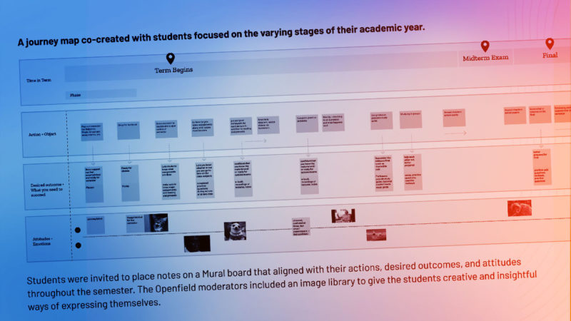
Optimize the discovery phase for your EdTech product with this guide
The discovery phase sets the stage for the successful launch of your EdTech product. Our latest resource guides you through the process and the tools to maximize this first step in the UX process. The result? Stronger alignment among your team and a better experience for your users.

Article
Avoid user testing fatigue with this 2-part approach
Regular input from users is critical to the ongoing success of your EdTech product. After all, your product is designed to meet the needs of your users. However, relying too heavily on a single group of users for feedback increases the likelihood that they will fall victim to user testing fatigue. Just as the name implies, user testing fatigue describes a condition that affects people asked to give feedback over and over. Symptoms include disengagement in the feedback process and a growing apathy to providing responses.

Article
Trust debt: How minor inconveniences in your EdTech product grow into a pricey liability
In the world of EdTech product development, accumulating some degree of debt is acceptable. Minimal levels of design debt (design-related inconsistencies that occur within a product over time) or technical debt (shortcuts in development that prioritize speed over perfect code) are a reflection that you’re constantly evolving and updating your product. What happens, though, when multiple debts mount over time and cause increased user frustration? The result is trust debt — an increasing lack of confidence in your product and your brand.

Interactive modules redesigned to meet learning objectives on any device.
Macmillan Learning: Interactive Modules Interactive modules redesigned to meet learning objectives on any device. Using pedagogical learning objectives as our consistent guide, we designed accessible, interactive modules from the ground up. The goal was to provide a rich, exploratory learning experience that supported a wide range of user needs.
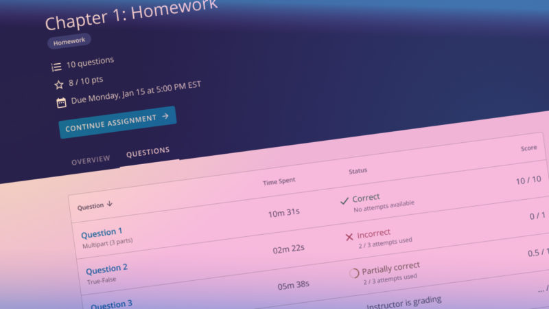
Multi-phase research and design drive high-impact improvements to the student assignment experience
Wiley Publishing: WileyPLUS Student Assignments Multi-phase research and design drive high-impact improvements to the student assignment experience. Student assignments are complex by design. When that complexity is amplified by technical constraints, retrofitted navigation, and poor information hierarchy, it results in a frustrating experience for students and instructors. Openfield harnessed the complexity into a focused experience […]

Resource
Early research recap worksheet: A timesaving guide to capturing key testing session insights
Sure, it would be ideal if you could sit in on all your EdTech product’s test sessions. But as a product owner, it probably feels like there are never enough hours in the day. You simply can’t be present every time users test your product. But you also don’t have to wait until testing is complete to get up to date. When you access this Early Research Recap Worksheet, you can squeeze the most value out of each round of UX research. It provides a thorough report of what’s happening, as it’s happening — and the answers to your most pressing questions.

Resource
User testing preparation worksheet
A speedier design process and a better end-product are possible when your UX designers and researchers work in lockstep. And that requires their continuous communication at all points of your product’s development process — especially in user testing. Download this free user testing worksheet that our UX designers and researchers created together in order to: track important user testing dates and links, describe users and research goals, and provide a list of research questions, tasks, and subtasks.

Article
A primer on how to design your EdTech product for cross-cultural users
When you identify that you have cross-cultural product users or you want to expand to other regions, design complexity ensues. Your EdTech product’s UX design choices are important; everything from color to copywriting directly impacts how your users experience your product. Each design element either helps meet your users’ needs — or prevents them from being met.

Resource
Guide to UX reporting essentials
Your UX research reports serve as a guide for your EdTech product team’s decision making. They should also be an important artifact for design and product development in the future, and as such, must be clear, organized, and insightful. Use our free guide to help you tell a compelling — and enduring — research story through your reports.

Article
Is your EdTech product powered by the best data fuel? Ask your UX research partners.
In the EdTech industry, data drives business decisions — and that’s a good thing. Leaning into facts and metrics prevents you from being sidelined by assumptions and blinded by bias. Plus, data is available for your whole team to use. Shared data points can keep your team aligned and create ways for them to collaborate and connect. But data can be incredibly difficult to sort through; it’s not automatically helpful and instructive.

Resource
The product leader’s guide to discovery sessions
Whether you’re launching a new EdTech product or making improvements to an existing one, discovery sessions are a critical step that will allow your product team and stakeholders to develop a shared vision and strategy. To make the most of this inherently collaborative, interactive process, you’ll need clear goals and a practical agenda. Download our free guide to learn how to conduct a meaningful discovery session for your next UX research and design project.

Article
Tip the balance of power users: why new, casual, and non-users are essential to product testing
Your EdTech product has a unique and constant challenge: It must meet the ever-evolving needs of your users. And UX research that includes frequent user testing is critical to identifying those needs. Your research can’t provide meaningful insights without the participation of the right users. Just who the “right” users are depends on the goals of the testing cycle. Unfortunately, product testing sessions tend to lean heavily on the involvement of the same users over and over again: power users. Power users know your product well and use it to its full potential.

Resource
The art of talking to users: A UX testing script guide
When it comes to product development, user insights are invaluable. After all, it’s crucial you develop an EdTech product your users actually want and need. To glean that insight, you’ve got to understand how to effectively talk to users — without influencing their responses. Download our free guide to learn how to craft smart testing scripts that yield the most accurate, actionable user feedback.

Article
EdTech products must meet the needs of hybrid classrooms. UX can help.
The COVID-19 pandemic turned the traditional in-person classroom experience on its head. Students were suddenly remote, and instructors scrambled to continue teaching. While most students have returned to the classroom, the hybrid model — where some students are in person and others are remote — is likely here to stay. And that brings a series of unparalleled challenges and opportunities for EdTech products. This evolution of the traditional classroom offers great freedom and flexibility for both instructors and students. But it also presents new problems for teaching and learning. Effective UX design can help defray pain points and create products that are valuable for all users — whether they’re in-person or remote. For your EdTech product to have a lasting impact, it must accommodate the realities of the hybrid classroom.

Article
Just how valuable is your EdTech product? Ask both your UX and market research teams.
UX research and market research both assess the value of your EdTech product for its users. These two distinct groups of researchers have pretty different ideas of what “valuable” actually means — and how it’s measured. Your UX research team determines your product is valuable when it meets the needs of students, instructors, and administrators in learning environments. The central question for UX is whether or not your product is helpful in an educational environment and easy to use. Market researchers, on the other hand, ascertain your product is valuable when your product is purchased. The most important questions for market researchers are, “Will this product sell? And to whom?”

Article
Synthesize your EdTech UX survey results efficiently to save time and budget
If you’re developing your EdTech product in an environment of rapid iteration, tension can run high. Even though you’re moving fast, you still need to stay close to the reason you are creating a product in the first place: your users’ evolving needs. And that means you’ve got to simultaneously conduct UX research and keep up the pace. Some research methodologies are better than others at different points of your product development. When you’re working under a tight deadline, you need research results in a matter of days, not weeks. User surveys can be effective research methods when you need actionable insights fast. Your research should always be rigorous and comprehensive, so you can make the best product decisions for your users. Keeping up the momentum while gleaning and integrating new insights? That’s a tall order.

Article
Ask your users: why UX research is key to an effective user journey map in EdTech
Knowing how and when to conduct UX research is mission critical for your EdTech product. With well-timed research, you have the insights you need to make the best product decisions. And most importantly, research provides a window into the minds of your product users. Your user journey maps are case in point. Mapping your user’s journey without UX research is like a modern-day cartographer working without satellite images. EdTech products shouldn’t rely on journey maps designed out of probabilities. It’s like using a compass and telescope when you have specialized mapping software at your disposal.

Article
No insight left behind: how to get the most out of your EdTech UX research participant
UX research is the cornerstone of your EdTech product — without it, you won’t be tapped into your users’ evolving needs. Knowing your goals is one vital aspect of research — and another is creating fruitful conversations with your research participants. As a product leader, you’ll want to make sure your research is being conducted in a way that provides the least biased and most productive results. If research conversations aren’t adapted and adjusted to get the most out of your participants, insights are being left behind. In order to meet your UX research objectives, your team ought to define suitable interview demeanor and refine strategies with participants.

Article
Maximize the value of UX research — and build a product users love — with strategic prioritization
You already know UX research is integral to developing EdTech products users can’t live without. Whether you’re launching a new product or taking an existing one to the next level, research is a skeleton key with the power to unlock your users’ needs, preferences, pain points, and mental models. But with each successive round of research, your insights can quickly add up to an embarrassment of riches. You can’t possibly tackle everything at once. Not only that, but not all UX research findings are created equal. So how do you choose which of the many findings your research team uncovers to focus on first?

Article
Is your EdTech product poised to stay relevant in the post-pandemic world?
During the coronavirus pandemic, educators turned to EdTech to bridge the gap between traditional and remote learning environments. Demand for EdTech products spiked as companies like yours worked overtime to accommodate wave after wave of new users — and adjust to radically different user needs, too. It was a wildly turbulent year, one that required your team to work at a breakneck pace while managing the stress of living through a global pandemic. And it was equally wild from a business standpoint. With so much new demand, the past year was, for many EdTech companies, an unprecedented success.

Article
What are your EdTech product’s biggest competitors? The answer may surprise you.
Competition in the EdTech space is fierce. So it makes sense that you keep a close eye on what your closest competitors are up to. You’re probably acutely aware of any gaps between your own product’s capabilities and those of your biggest rivals. So much so that achieving feature parity may be a top priority when planning your product’s roadmap. No doubt about it: It’s crucial to understand and keep pace with your competitors. But just because the most comparable EdTech product on the market offers a particular feature or functionality doesn’t necessarily mean you should, too.

Article
Avoid these mistakes to craft effective UX research surveys and improve your EdTech product
Surveys are critical tools for UX researchers. In the EdTech space, they can be used to collect standardized feedback about your users’ needs as well as your product’s usability. Yet not all surveys are equally useful. The quality of your surveys, which depends on how they are written and structured, can significantly impact the value of your findings. Unfortunately, the ability to craft clear, effective, and unbiased surveys is a skill not all product teams (or even UX firms) possess.

Article
A Field Guide to UX Research: How (and why) to craft a customized research plan for your EdTech product
All products — yours included — are only as good as users believe them to be. Which means any EdTech product’s success hinges on its ability to anticipate and solve users’ most pressing problems, both in and out of the classroom. And it’s safe to say that without UX research, your product’s design is little more than a stab in the dark. Why is it, then, that so many EdTech companies struggle to appropriately leverage UX research in their product development process?

Rapid adoption of digital transformation leads to the world’s top student engagement system
iClicker Rapid adoption of digital transformation leads to the world’s top student engagement system. iClicker came to Openfield with a vision to create a digital experience that would improve on its already pervasive handheld remote devices. The resulting experience quickly led to market dominance by giving instructors new ways to engage with their students who […]

Research leads to design improvements that better align to how users think and work.
Wolters Kluwer Health: CoursePoint+ Research leads to design improvements that better align to how users think and work Openfield helped Wolters Kluwer uncover a serious issue that was causing user friction in their product, CoursePoint+. By realigning the user experience to mirror how instructors think and work, we eliminated user frustration and increased satisfaction. In […]
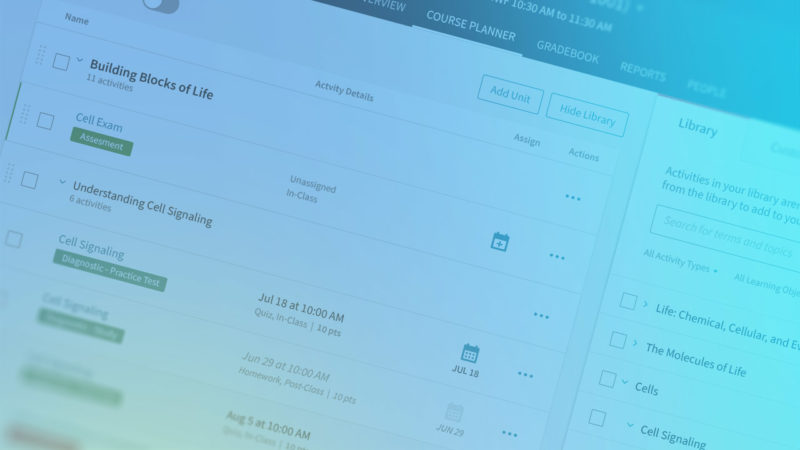
New design system reduces wasted time and unifies user experiences across the product suite
Macmillan Learning: Design System New design system reduces wasted time and unifies user experiences across the product suite Because Macmillan Learning’s suite of EdTech products were designed at different times by different teams, growing design debt was leading to duplication of internal efforts and inconsistencies in the user experience. Openfield analyzed the issues, created a […]

Article
How adopting a scientific approach to EdTech UX can maximize your ROI and boost revenue
As an EdTech leader, you know your product needs to be user-friendly to succeed in the market. And you also know user research is key to designing solutions that satisfy and delight. At the same time, though, you may have a hard time defining the true ROI of your UX investment. Without the ability to directly connect UX activities to measurable business outcomes, you may struggle to justify your UX spend — whether that’s to your board, your funders, or even yourself.

Article
When (and how) to use beta features in your EdTech product
User research is a cornerstone of digital product design and development. And conventional wisdom dictates that you should thoroughly test new features and functionalities before you release them to users. But there’s one notable exception to this golden rule: beta features. Presenting a feature as “beta” can be a great way to increase your team’s agility, go to market faster, respond more quickly to your users’ most pressing requests, and test out concepts on a wider audience.

Article
EdTech users are more stressed than ever. Here’s how to be part of the solution.
As the coronavirus pandemic continues to upend life as we knew it — including the usual in-person educational models — students, teachers, and administrators are more stressed than ever before. You’ve seen it with your own eyes. Your EdTech product users are struggling with unprecedented challenges. And they have the elevated anxiety to match. To design the right solutions within your product — and effectively reduce user stress — you must first look at your users’ lives outside your product.

Article
Preselected vs. custom user panels: How to find the right EdTech users for your research efforts
You already know that user testing is critical to the success of your product. But for many EdTech companies, actually sourcing test users is a perennial challenge. You see, when it comes to user testing, not just any users will do. You can either build a bespoke set of actual users of your product or you can utilize a service that brings their own preselected group. In order to get meaningful insights, you need to start with the right users.

Article
Crunching the numbers: how statistics lead to smarter decisions for your EdTech product
User testing is the key to creating an EdTech product your users will love. That’s the whole reason you do it in the first place: To uncover critical user insights and leverage them to make smart, user-centric design decisions. But the truth is that simply conducting the research — even well-designed research — isn’t enough. In order to get meaningful takeaways from your research findings, you must apply the right level of statistical rigor.

Article
How to use baseline UX metrics to fine-tune your EdTech product plan
If you’re like many EdTech companies, you probably don’t have concrete data on how your competitors’ products perform at the task level. But your ability to set the proper usability targets for key tasks within your own product depends on your ability to do so. Establishing task-level baseline metrics is the only way to properly prioritize your UX team’s efforts moving forward. Here’s what you need to know to ensure that you use these metrics to maximize the ROI of your efforts.

Article
How to leverage your user research findings to create a compelling value proposition
In the world of consumer digital products, the buyer is almost always the end user. And in many ways, this makes everyone’s job easier, from business executives to your sales and marketing teams. But in the world of EdTech products, the same thing can’t be said. Students are by far the largest EdTech user group, yet they almost never have the power to decide which products they will be required to use as part of their education experience.
Article
Choosing the right UX metrics can make or break your EdTech product research
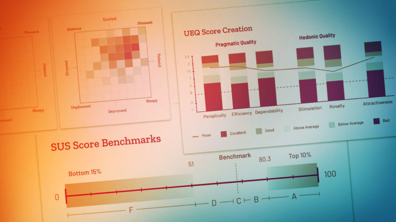
There’s no such thing as a one-size-fits-all UX metric. Rather, there are a number of key metrics you can pull from depending on the situation. Your prototype’s fidelity, the scope of what you are testing, your test objectives, and your internal stakeholders’ preferences all play a role in determining which metrics make the most sense at any given time. Here’s what you need to know to select the right metrics for your EdTech product.

Article
How an external UX research partner can help you avoid biased results and internal pressures
As an EdTech product leader, you understand how important user research is to your product’s success in the market. You know you need to invest in UX research. But how? You may be weighing the pros and cons of hiring your own internal UX researcher versus partnering with an external UX team. Hiring an external UX research team like Openfield comes with many benefits.

Article
Digital doesn’t equal remote: EdTech insight in the era of COVID-19
In the midst of the ongoing coronavirus pandemic, schools across America are embarking on a totally unexpected — and wholly unprecedented — remote-learning experiment. As the fall 2020 semester kicks off, K-12 schools and higher education institutions everywhere are tentatively rolling out a variety of remote instruction plans. As they scramble to make this arrangement work, educators are looking to EdTech to help close the loop.

Article
Why your UX research plans must align with your EdTech company’s business goals
UX research is a critical component of product development. It’s the key to unlocking your users’ needs and preferences. And it’s what enables you to build the best, most user-centric EdTech product possible. Of course, you already know to include key workflows and features in your user testing plan. But what about your broader business objectives — the quarterly and annual goals by which you measure your product’s progress?

Article
Fuel smarter EdTech product development plans with discovery phase prototypes
The discovery phase of any EdTech project — whether a new product launch or a feature update — is all about gathering information. Of course, this usually includes a variety of activities. You might simultaneously be hammering out business objectives, performing a competitive analysis, and interviewing your users, among other activities. The goal? To emerge with a full understanding of your big-picture problem, as well as a keen sense of how best to solve it.

Article
How to use loss aversion bias to evoke more meaningful user feedback on your product
As a product owner, you know that your users’ feedback is the most valuable asset in your arsenal. After all, your EdTech product can only succeed to the extent that it actually meets your users’ needs. And the more deeply you understand your users — their desires, mental models, requirements, and preferences — the more perfectly you can tailor your product to suit their taste. So it’s imperative that you draw out frank, unbiased, and uncensored feedback in every round of user testing.
Article
How EdTech product executives can make sense of mounting UX research data as products scale
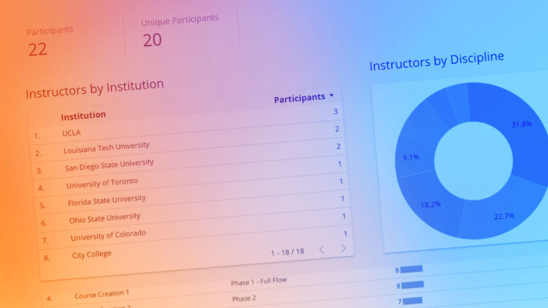
If your EdTech company is committed to your product’s UX, then you already know UX research isn’t a one-and-done activity. It’s an ongoing, holistic part of your product life cycle. Which means that your UX team may generate dozens of research reports over the course of a single year. Each individual report tells a story and provides actionable insights. But as your research scales, so does your data. Before you know it, you can amass an avalanche of information — with no simple way to make sense of the bigger picture story it tells.

Article
The formula for clear & effective UX research reports
EdTech companies like yours rely on UX research to make important decisions about your product. Each of your key stakeholders — including your product and executive leadership teams — must clearly understand your research findings and the recommendations that flow from them. So it’s critical that your research reports are clear and effective. Like the EdTech products you build, research reports are only effective to the extent that they serve their end users. Unfortunately, they are too frequently only formulated with a researcher’s mindset. That is, they are so focused on documenting the individual trees that they fail to also tell a compelling story about the forest.

Article
How to use digital focus groups to quickly gain actionable insights
Your EdTech company may already be in the practice of utilizing focus groups. They can be a great way to bounce new concepts off your users and glean insights about their preferences and mental models. But what about digital focus groups? You may be cringing at the very thought of hosting these events at all, let alone digitally. You might be concerned that they are less personal or effective when hosted remotely. However, with the right approach and tools, digital focus groups can be an extremely engaging and cost-effective way to gain crucial feedback. Here’s what you need to know.

Article
How many users do you really need for meaningful usability test results?
You probably already know that you can conduct meaningful usability tests with as few as five users. This widely-adopted tenet of UX research and design has endured two decades because it’s both surprising and heartening. After all, it shows that UX research doesn’t have to be expensive and time-consuming. To the contrary, it can be quick, accessible, nimble, and cost-effective. That’s good news. And in general, the guideline holds true. However, it’s important to recognize that the “five users rule” is more rule of thumb than rule of law.

Article
Squeeze the most value out of each round of UX testing with early research recaps
As an EdTech product owner, you likely know the drill when it comes to UX testing. You work with your UX research team to identify testing priorities. Next, your research team goes off and conducts user tests. A week or two later, you receive research findings. But there’s a better way — a very simple tweak to this process that allows you to be more engaged in user testing, drive more value out of each round of UX research, and iterate more quickly? The solution can be found in what we call “early research recaps.”

Article
Want to create a truly inclusive EdTech product? Start with inclusive UX testing.
EdTech products must meet the needs of the students, teachers, and administrators they serve, regardless of ability. The goal of inclusivity doesn’t just make sense because it is the right thing to do. Or because it is in keeping with the goals of educators more broadly. It also makes sense because it leads to a better-quality product — for everyone. For all of these reasons, more and more EdTech companies are embracing inclusive design.

Article
Are your UX design and research teams working in lockstep?
The best EdTech products, the ones that instructors, students, and administrators value most, are those that truly anticipate and meet their users’ needs. Developing a product with a superior user experience requires the right UX expertise, of course. But that’s not all. Your product’s usability also depends upon how well your product team coordinates and collaborates during the development process.

Article
Why your engineering team should regularly attend your user testing sessions
When your engineering team is in the midst of an agile development sprint, they must be laser-focused on the tasks that comprise the next leg of their work. That sort of tunnel-vision is a good thing. Good, that is, so long as it’s tempered with an appreciation of your users’ needs. You see, unless engineers intentionally approach their work from an empathetic, user-centric perspective, they will naturally prioritize technical limitations and considerations over other factors — sometimes at the expense of user needs.

Article
The right people at the right time: Building a best-fit user feedback panel for user tests
User testing is a critical component of the product development process. You need your users’ feedback to shape your EdTech offering in a way that meets their needs and creates an enjoyable user experience. But when it comes to following the best practices of effective UX testing, not just any users will do. The reliability of your tests depends on your ability to recruit the right mix of users at the right time.

Resource
Observe your users in the wild with this downloadable worksheet
When you’re observing users in the wild, one thing’s for sure – there’s a lot going on. To help you capture key insights, observations and ideas on-the-fly, we’ve created this worksheet you can download and print to make sure you don’t miss any important details when you’re in the field.

Article
Quality reporting is the key to realizing the full ROI of actionable UX research
Most EdTech companies now understand the importance of UX research in developing products that meet the needs of students, instructors, and administrators. But the thing about UX research is that it’s actually only the first half of the equation. Without thoughtfully prepared reporting, your UX research is really just a pool of data. By adopting effective presentation strategies for reporting research results you can ensure your findings are carried through the rest of the development process.

Article
Early and often: The importance of UX research throughout the product development process
EdTech companies are increasingly recognizing the importance of UX research in successful product development. The numbers bear this out, with industry surveys showing an uptick in companies who identify the need to conduct more in-depth customer research as digital products continue to revolutionize the marketplace. That’s a step in the right direction, for sure. But the reality is that many product teams remain uncertain about when and how to incorporate UX research.

Article
UX research methods (part III): When to use quantitative data to justify product improvement decisions
Qualitative research may be the bread and butter of UX testing, but quantitative UX research methods have an important role to play in the iterative product design process. There are many reasons product teams should consider using quantitative research, from the identification of existing problems to justifying expenditures in order to get buy-in from stakeholders.

Article
UX research methods (part II): Unlocking user insights with qualitative testing
In this article, we’ll dig into qualitative UX research and explain what it is, why it’s important, and how your team should approach it.

Article
UX research methods (part I): Avoiding user bias with observational user testing
User testing is a crucial component of successful product design. Without the insights that on-the-ground testing yields, designers can only guess at how users will actually interact with their products.

Article
How CX and UX come together to meet users’ needs and inspire loyalty
A harmonious integration of customer experience (CX) and user experience (UX) is especially important in EdTech, where educational IT managers and instructors have become accustomed to not just strong products, but also to comprehensive, personalized service.

Article
Nontraditional learning: How EdTech tools are different for corporate and personal users
When most people think EdTech, they naturally imagine students and instructors in K through 12 or higher education settings. But learners and teachers can be found everywhere from boardrooms to living rooms. And while the reasons for learning vary, companies that make learning products for corporate and personal use can benefit greatly from the knowledge of their counterparts who target K-12 and higher ed sectors.

Article
Makers of classroom technology must align product releases with academic calendars
In general product design, frequent releases is accepted as the best way to update products. But in EdTech, timing can be the difference between success and failure. Learn the best practices for product design and development release cycles that consider the natural cycles of academic calendars.

Article
Are your stakeholders user research skeptics or superfans?
If you’re an advocate for user research in an organization that doesn’t value it, you might feel like you’re shouting into the wind sometimes. Too often, stakeholders (and we’re talking about executive leadership and even designer/developers) consider research an obstacle to rapidly launching a product or update. Recruiting users to interview, analyzing results and reporting on findings takes time, and in a quick-turn release cycle it may be too late by the time you get the answers you need.

ARTICLE
Building powerful EdTech tools starts with understanding students & instructors
Remember that you’re creating products for two audiences with distinct but overlapping needs. Instructors select the tools for their classrooms, so tech companies often develop products with them in mind. But for every one instructor there may be 600 student users, and if something goes wrong with the app, instructors get 600 emails about the problem.

ARTICLE
Research vs. design: balancing your UX budget for better outcomes
In the mad dash to launch a new product or major upgrade, product teams tend to expend more energy on designing features than on understanding users. In organizations that don’t place a high value on user insight, there’s a perception that design moves a project forward, while research holds it up.

ARTICLE
Looking for inspiration? Go off-screen.
Sometimes, the best problem-solving comes from shaking off tunnel-vision and stepping out from behind a screen.

ARTICLE
Three ways research improves UX outcomes
Research is the foundation of best-practice UX, leading to gains that can be transformative for digital products. But all too often, product teams either forego research altogether, or they fail to implement it properly.